I’ve been going to a graduate class in science communication this semester. Doug taught us the rule that if you’re using a bar graph, the y axis must start at 0. Otherwise you end up with trickery like this:
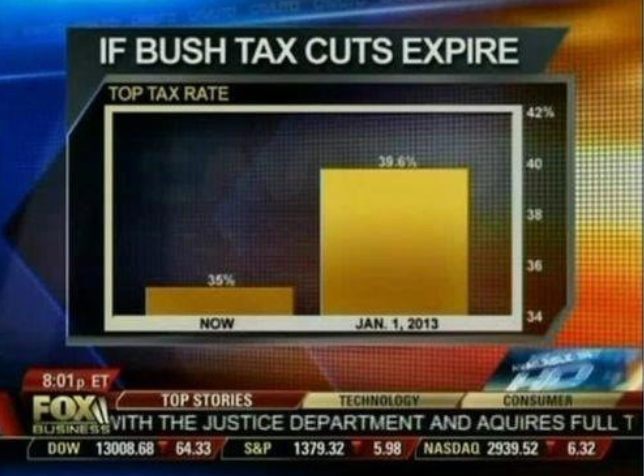
Fox News continues charting excellence. From flowingdata.com
In bar graphs, area communicates magnitude. Change the lower limit of the y axis, and you change the relative area of your bars. If the graph above included 0, it would indicate a much smaller difference between the two tax rate scenarios of 34% and 39.6%. Pick a different lower limit and you distort the message, something that Fox News has figured out to great effect.
I don’t think I’ve made a bar graph since my undergraduate days. In most cases, I think dot plots or line plots are a better choice (though there are some exceptions! bar graphs can be good for percentages, for instance). There’s one case, though, that throws a wrench in the whole “start at 0” rule, and that is temperature:

Temperatures at the Marcell experimental forest in Minnesota, USA. USDA Forest Service.
The trouble is that for typical temperature units, the 0 mark is totally arbitrary. 0F does not equal 0C, for instance. This means that the difference in area communicated by the colored regions of this graph is arbitrary as well, no matter what the 0 mark. Here’s another example from the Washington Post:

You really can’t deny global warming after seeing this graph.
So never use a bar plot for temperatures. Use a dot or line plot instead! And include error bars, so the magnitude of the difference can be judged relative to the variation in the measurement.
From March 2, 2015