The team currently has access to monthly energy and water data for each building on campus and much higher spatial and temporal resolution for the Canal Building. One of our mandates is to make these data publicly available and easy to use. For now, some building data can be found Carleton utility data.
Here are some sample visualizations that the team has developed so far. Carleton University spends about $12M on energy and water for its 45 buildings per year. The high and non-so-high performance of each building can be visualized in this 3D tool (click image to go to tool).
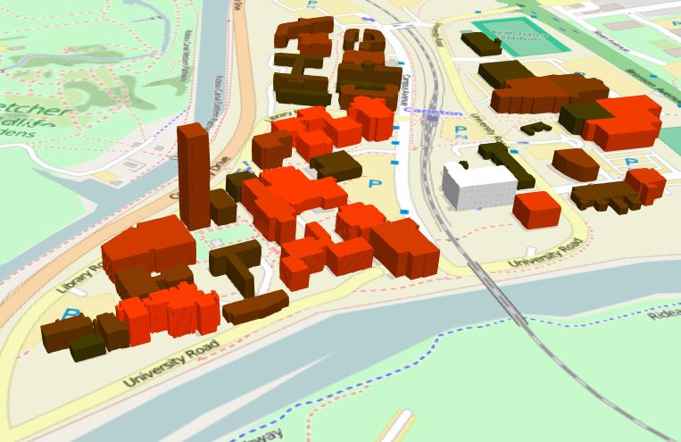
Campus energy 3D map visualization tool
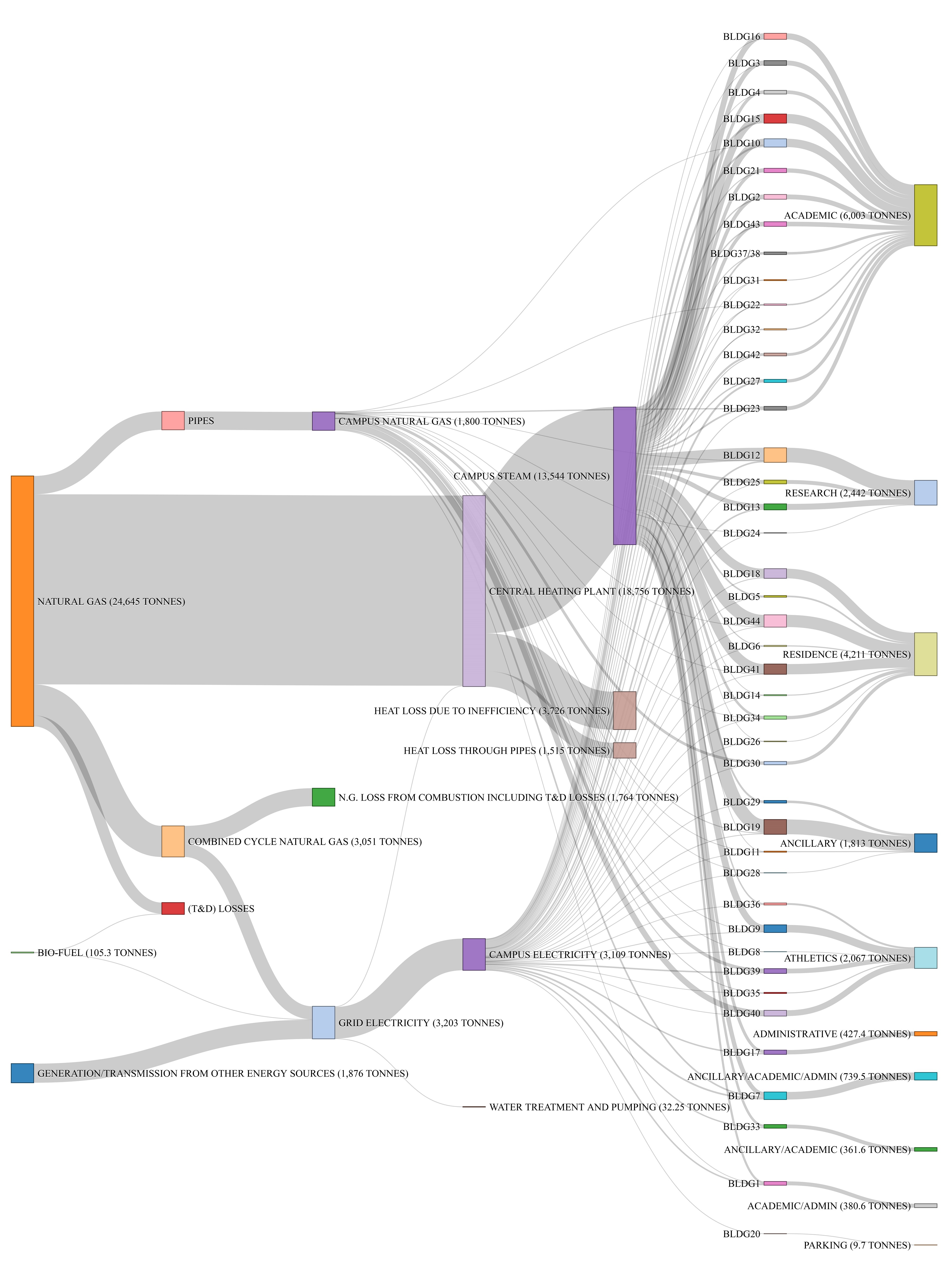
Below are Sankey diagrams for annual energy consumption, mass flow, carbon emissions, and utility costs. The full details can be found in our recently published paper titled Visualization of Energy and Water Consumption and GHG Emissions: A Case Study of a Canadian University Campus.
The aim of these diagrams to facilitate the decision-making by the Facilities Management and Planning (FMP) and other stakeholders. We are also developing Sankey diagrams at the building and HVAC scales.
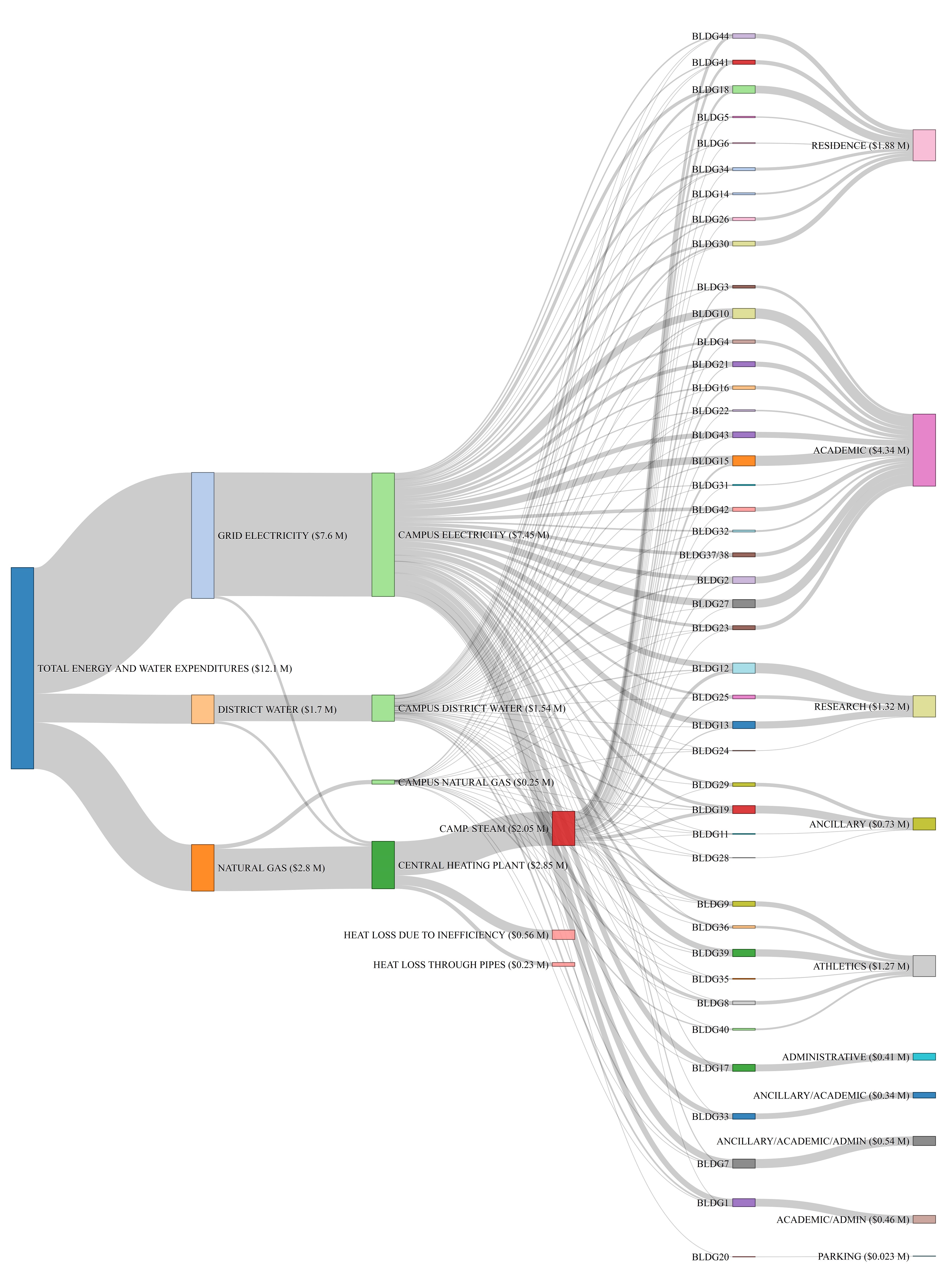
Campus utility costs (click images to view clearly in full size)
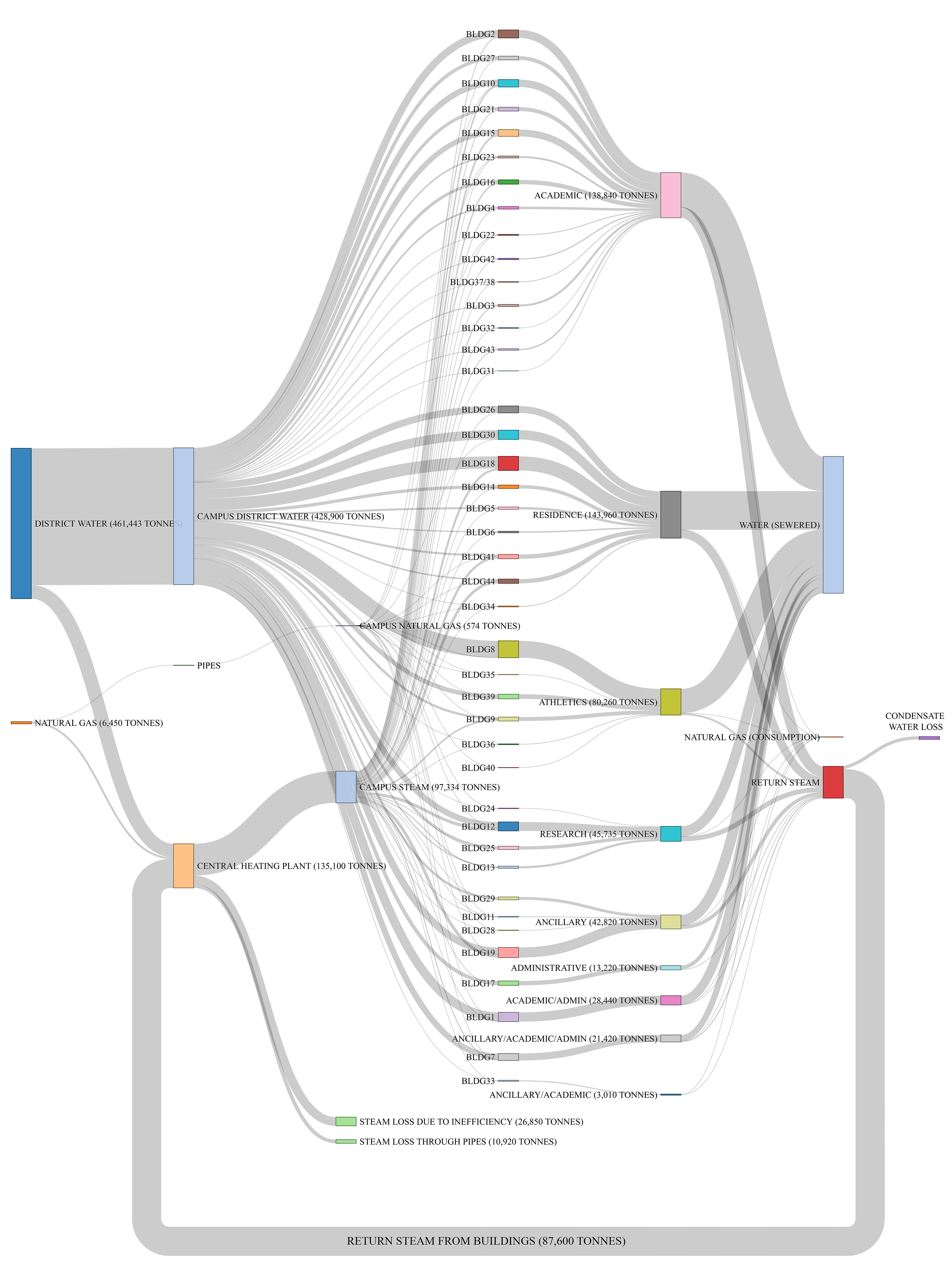
Campus mass flow (water, steam, and gas)
Campus GHG emissions as a result of energy and water consumption
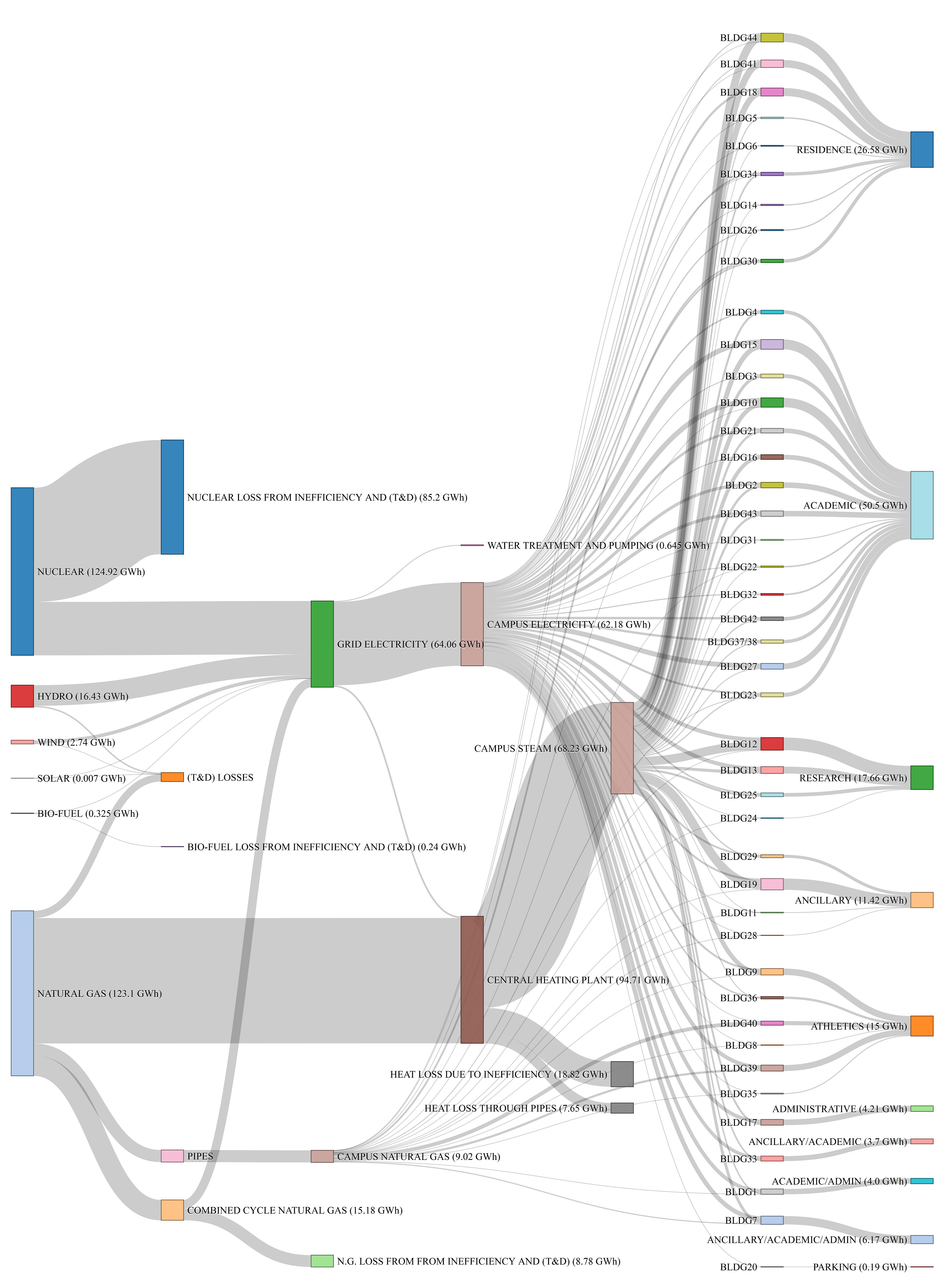
Campus energy use from primary (source) energy to end use