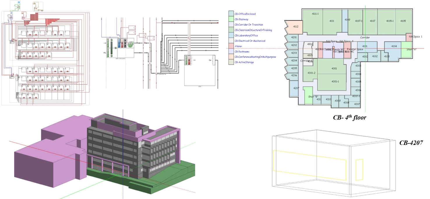
In partnership with CIMS and Autodesk, we are developing data analytics and visualization tools to improve building performance. Our test-bed is the 45-building Carleton University Campus. Key initiatives include:
- Developing Sankey diagrams (see examples below) to help building operators and other stakeholders understand energy, GHG, and water flows at multiple time and spatial scales.
- Tool for real-time spatial mapping of campus building performance data.
- Development of Building Information Models (BIMs) of all campus buildings and a methodology for a workflow to convert the BIMs to simulation models.
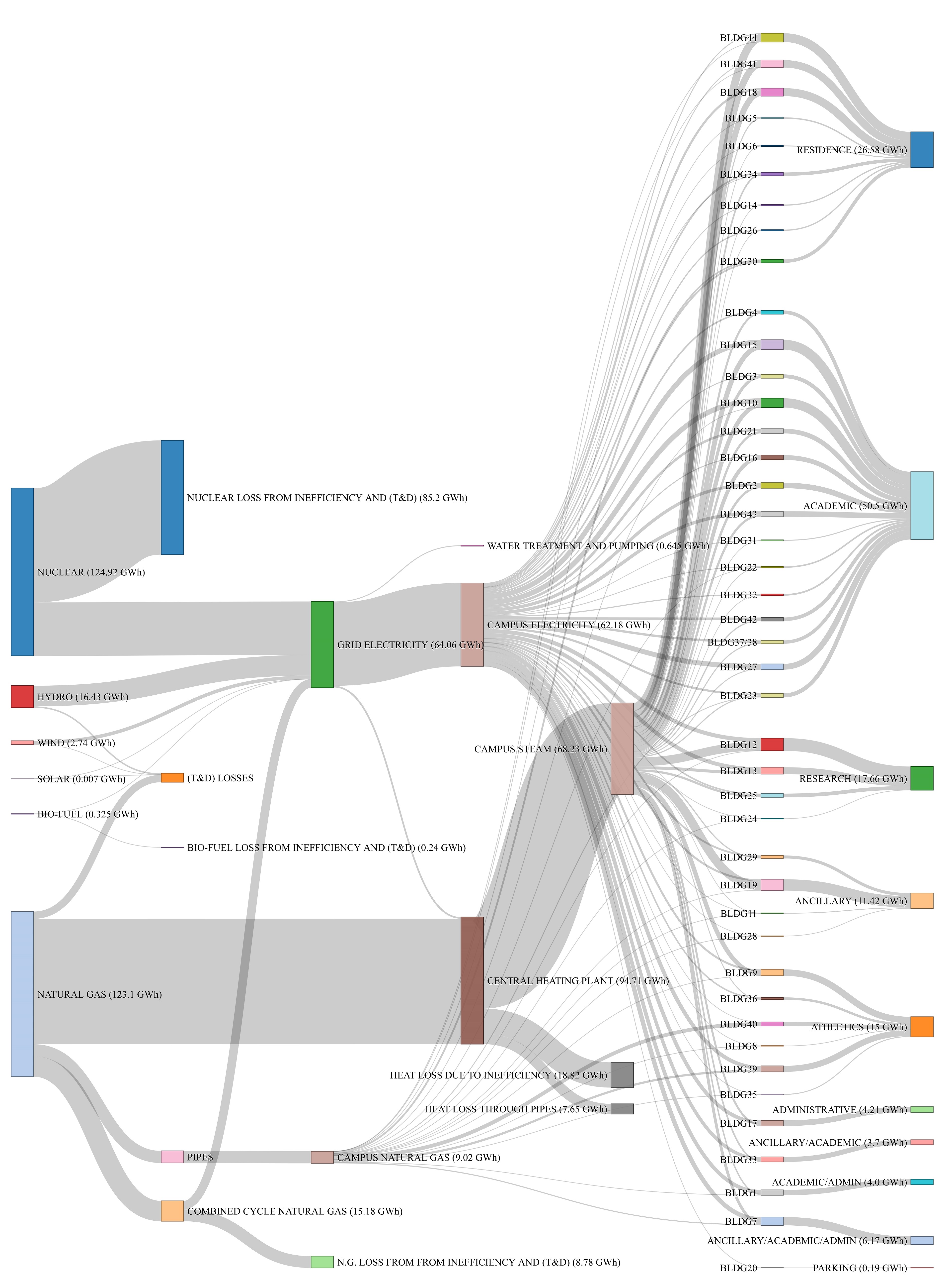
Sankey diagram that illustrates the source and sink of energy for Carleton’s 45 buildings, based on real data in 2014
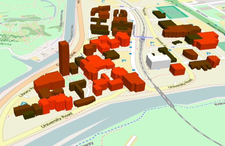
Campus energy and water use 3D map visualization tool