The Importance of Brand Colours and How to Pick Them
In our last blog post we discussed optimizing your print jobs by choosing the correct colour mode for your design format. In this post we will dive into the importance of colours for your brand and how to pick them.
The Importance of Brand Colours
Colour plays an important role in marketing. When designing the branding and logo of your company, colours play a crucial role. This is because they are the first things your target market thinks of when thinking of your brand. Colour is one of the first things your target market sees and can play a significant role in consumer behaviour.
When you think of Starbucks, you think green, when you think of McDonalds, you think of yellow arches and when you think of Facebook, you think blue. These brand colours are seen throughout the brands entirety. Facebook’s website is full of blue accents, the logo is blue, and blue is all throughout the user experience. Starbucks has green in their store, on employee uniforms, on the website and app, and on packaging. Colours are a great brand identifier and it is important they relate to your brand.
Colours and Emotions
Colours can elicit specific emotions and affect us in many different ways as they have the ability to create specific moods. Colour sets the mood of brand expression. Emotions are powerful and have the ability to drive decision making. Brands want to cultivate strong emotional connections with their customers and this can’t be done with just a logo; colours are needed to cultivate these emotions. How consumers feel about a brand has more pull than what they think of a brand. Furthermore, if you couple this with the fact that we know certain colours evoke certain emotions, your brand colours then have the ability to impact sales and performance.
Moreover, repetition of the same colour(s) can strengthen brand recognition and awareness. If you are consistent with your brand colours, they become part of your brand in the eyes of your target market. One way to be consistent is to incorporate your brand colours throughout the entirety of the user experience. This means having your brand colours in your brand collateral like your logo, website, storefront, in-store design, staff uniforms, packaging, and advertisements. Using the same colours in all your brand collateral strengthens your brand’s association with those colours and by extension, strengthen brand awareness as a whole.
With all that being said, you must choose your branding colours carefully as they have a direct influence on your brand identity. Before determining your brand colours, you must determine your brand identity and personality so you can pick colours that elicit that identity.
So you have your brand identity and personality, now you need to determine which colours match that. Here is a chart of brand colour meanings and the affect that the different branding colours can have on people.
Colour Meanings and their Affect on People
| Colour | Colour Meaning | Affect Branding Colours can have on People |
|---|---|---|
| Red | Passion, excitement, love danger, and anger |
|
| Orange | Playfulness, vitality, happiness, and friendliness |
|
| Yellow | Happiness, youth, energetic, comforting and optimism |
|
| Green | Stability, health, wealth, prosperity, calming, relaxing and growth |
|
| Light Blue | Tranquility, trust, openness, calmness, spirituality, and innocence |
|
| Dark Blue | Professionalism, security, and formality |
|
| Purple | Royalty, mystery, creativity, and luxury |
|
| Pink | Femininity, romance, sensitivity, tenderness, sweet, cute, charming, youth, and innocence |
|
| Brown | Rugged, aged, stability, support, warm, practical, dependable and earthy |
|
| White | Cleanliness, virtue, pure, health and simplicity |
|
| Gray | Subdued, classic, responsible, dependable, serious, mysterious, and mature |
|
| Black | Powerful, elegance, sophisticated, edgy, professionalism, simplicity, luxurious, and modern |
|
Picking your Brand Colours
When picking your brand colours there are a number of things to be considered. First, you need to think of your target audience. Who is your target audience, what do they care about, what mood do they need to be in to engage with your products and brand? What colour best anchors the meaning of your value proposition to your target market and distinguishes you from the competition? You must ask these questions before determining which colours suit your brand best. You should also consider where your consumers are using your product; if it is outdoors, you may want to bring in colours from the atmosphere and place your product is used like green and brown for trees or blue and sand for a beach.
You also have to consider what the colours you choose mean in different cultures; especially if your brand is present outside of your home country. Colours mean different things in different cultures so you want to be sure these interpretations are in line with your brand. Furthermore, colour perceptions and meanings change with age, social class, gender and religion as well, which is why it is so important to understand your target market. Again, it is critical to understand your brand personality traits too. Your brand personality traits coupled with your target customers should be the foundation of your brand colours.
How to Pick your Brand Colours
Here is a general framework for picking your brand colours. We are going to plan on choosing 3 brand colours, but there are some schemes that can have up to 4 colours. When working with 3 colours you should pick a base, accent and a neutral.
Base
When picking a base, you need to determine which of your brand’s personality traits is the most important. Your base colour should reflect your brand’s most dominant personality trait but also appeal to your target audience. This colour will not only be the base colour for your brand but it will also help you determine your other brand colours.
Accent
The accent colour you choose will be used the most after your base colour. This colour is critical and difficult to choose as it must match a brand personality trait as well as pair well visually with your base colour while also appealing to your audience. We will briefly touch on colour schemes to make it easier to pick your colours later on in this blog post.
Neutral
Finally, you need to choose your neutral. This colour will be present in most of your designs as it will most likely be a background colour so with this in mind, be sure to choose something that avoids added attention. Typically your neutral will be a hue of grey or a beige, white or off-white. Black is also an option but it tends to be overpowering. You know your brand and audience though, so choose what you think is best.
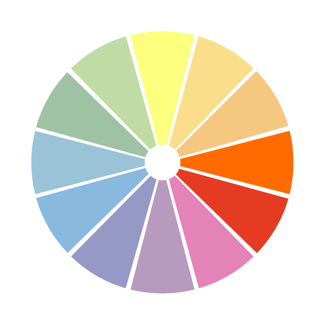
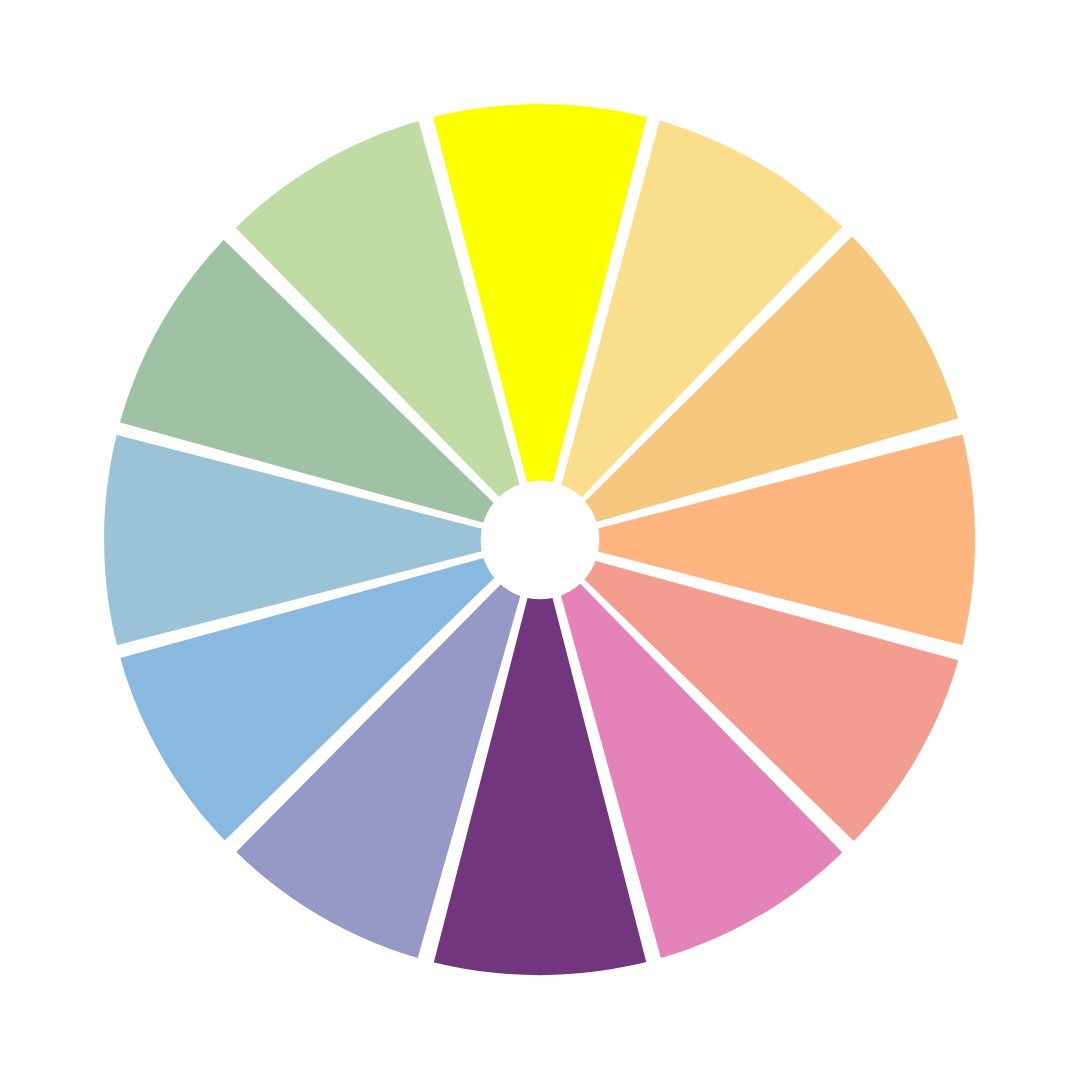
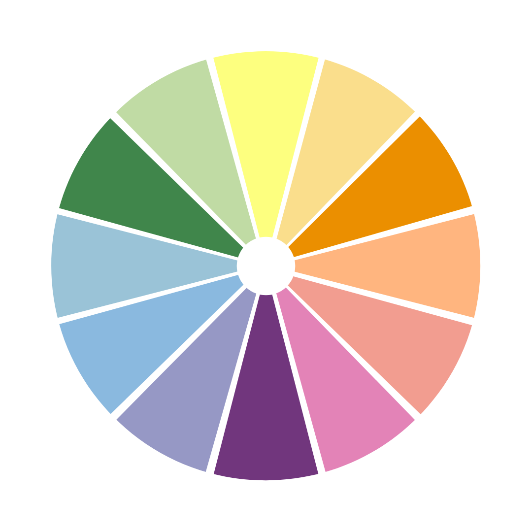
Colour Schemes
Now onto colour schemes. You should keep a colour scheme in mind when picking your colours because once you have your base colour, you can use colour schemes to help determine your accent colour(s). Typically, brands will use one of these common colour schemes: monochromatic, analogous, complementary, or triadic. You can use the Adobe Color website to play around with different colour schemes on the colour wheel.
Monochromatic
If you have one brand personality trait that is exceedingly dominant and important over other traits, a monochromatic colour scheme could be for you as this scheme will emphasize the meaning of that one brand colour. Picking different shades of one colour will emphasize that colour and in turn, that personality trait.

Analogous
Analogous colours are next to each other on the colour wheel. These schemes are safe, as the adjacent colours usually have some similar emotional connotations without being as bold and apparent as shades of one colour. Analogous schemes do not typically stand out as much as complimentary or triad schemes.
Complementary
Complementary colours are opposites that look great together. Complimentary colours are directly across from one another on the colour wheel and since they are opposites, they bring out the best in each other when paired. Complementary colours are good for dynamic, stimulating visuals but these schemes are popular so be sure you are not directly copying another brand.
Triadic
Triad schemes are a stable branding colour scheme. Triadic colours draw in equal parts from three different sections of the colour wheel. Triad schemes are on the safer side, like analogous schemes, but offer more stimulating variety like complimentary colour schemes. However, triads are difficult because you need these three colours to coincide with your brand identity.
Your branding colours are a key part of your brand as they can be present in many aspects of the consumers journey with your brand. They are on your website, logo, store design, advertisements, packaging and even social media so it is important to take the time and ensure your brand colours reflect your brand personality and appeal to your target market.
This is our second post in our brand guide series. Check out our first post, The Importance of a Brand Guide.
Subscribe to our mailing list to have access to exclusive discounts, be the first to know about new products and capabilities, as well as new blog posts.
Blog Post Topic Requests
"*" indicates required fields