Creating accessible PowerPoint documents – PC users
Because many files are often viewed electronically, governments, universities and industries around the world are implementing policies that require electronic and information technology to be accessible to people with disabilities. Below, we offer some guidance on ways to create accessible PowerPoint presentations.
There are some important issues that should be considered when an instructor or course designer creates PointPoint documents. Some of the basics and common issues are listed below:
- Add alternative text to images and objects
- Make sure slide content can be read in the order you want
- If designing a new slide, use the built-in slide layout
- Use hyperlink text that is meaningful
- Ensure that colour is not the only means of conveying information (and, when you do use colour, aim for a 3:1 contrast ratio or higher)
- Give every slide a unique title
- Structure tables for easy navigation (simple structure, specify column header information and avoid using blank cells)
- Use larger font size (18 pt or larger, sans serif fonts) and sufficient spaces
- Avoid using repeated blank characters for formatting
- Avoid image watermarks
- Include close caption for any audio and video
Add alternative text to images and objects
Alternative text, also known as “alt text,” appears when you move your pointer over a picture or object. Alt text helps people who use screen readers to understand the content of images in your document. For many readers, this is the only information they have about the images and objects in your document. Alt text should be included for any of the following objects in your document:
- Pictures
- Clip Art
- Charts
- Tables
- Shapes (that don’t contain text and are not in groups)
- SmartArt graphics
- Groups (all objects in this list, with the exception of shapes, should also have alt text when in groups)
- Embedded objects
- Ink
- Video and audio files
In the alternative text, you should describe the shape and intent of the picture or object briefly; never copy the image caption instead of providing alt text.
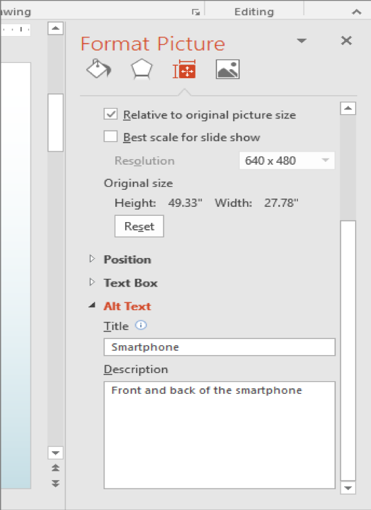
Adding alt text to pictures and graphics
- Right-click the image or object, and then click Format (for tables, click Table Properties or Format Shape)
- Click Alt Text (in PowerPoint 2013 and later, select Size & Properties first)
- Enter a description of the image or object into the Title and Description text boxes. Use clear but concise descriptions. For example, “a red Ferrari” tells the reader more about the image than “a car.”
- Click Close.
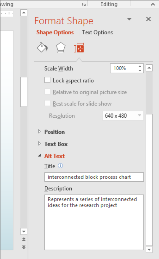
Adding alt text to SmartArt graphics and shapes
- Right-click a SmartArt graphic
- Select Size and Position
- In the right pane, select Alt Text
- Type in a description and a title
Adding alt text to charts
- Right-click a chart
- Select Format Chart Area
- In the right pane, select Alt Text
- Type a description and a title
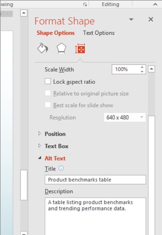
Adding alt text to tables
- Right-click a table
- Select Format Shape
- Click on Size & Properties
- In the right pane, select Alt Text
- Type a description and a title
Make sure slide content is read in the correct order
Usually, screen readers read the content of the slide in the reverse order that it has been added. For example, if you insert a picture before an object, the screen reader first reads the object and then the inserted picture. So, you should specify the order of the elements in the order that you want.
To set the reading order for PowerPoint documents, take the following steps:
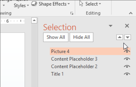
- On the Home tab, in the Drawing group, select Arrange, and then choose Selection Pane.
The selection pane lists the objects on the slide in reverse order. When the screen reader reads this slide, it reads the objects in the reverse order listed in the selection pane. - To change the reading order, drag items to the location that you want or select the item and then select the Bring Forward or Send Backward button.
Use the built-in slide layout
When you are trying to create a new slide, you want to make sure that your reading order is accessible. For this reason, it’s a good idea to use PowerPoint’s built-in slide templates.
To use built-in slides, take the following steps:
- On the Home tab, click Normal.
- In the Thumbnail pane, locate the place where you want to add the new slide. Right-click and select New Slide. Click the new slide to select it.
- On the Home tab, click Layout to open the gallery, and select the slide layout that you want. PowerPoint automatically applies this layout to the new slide.
- Go to the new slide, and add the title and content that you want.
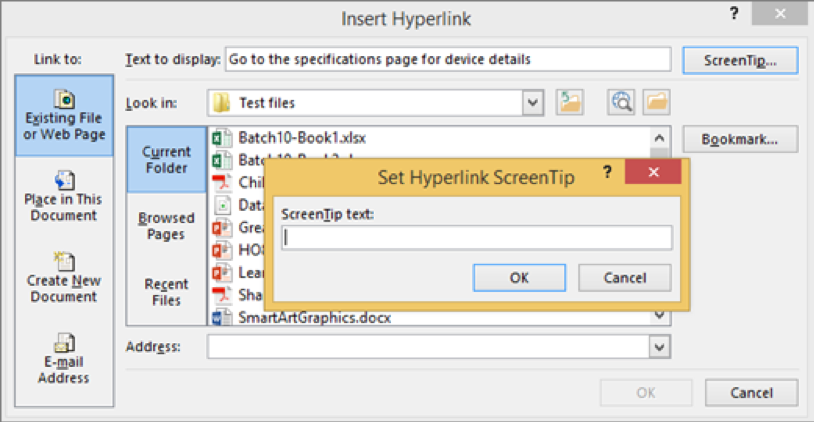
Use meaningful hyperlink text
Hyperlink text should provide a clear description of the link destination rather than writing out the complete URL or writing “click here.”
To add a hyperlink to your presentation, take the following steps:
- Select the text to which you want to add the hyperlink, and then right-click.
- Select Hyperlink. The text you selected displays in the Text to Display section. This is the hyperlink text.
- If necessary, change the hyperlink text (Text to Display).
- In the Address box, enter the description address for the hyperlink.
- Select the ScreenTip button and, in the ScreenTip text box, type a ScreenTip.
- Click OK.
Ensure colour is not the only means of conveying information
People who are blind, have low vision, or are colour blind may miss the meaning that is conveyed by colours. So, you should add an alternative sign to convey the meaning of your text. For example, you can add an underline to your coloured text so that people with a visual impairment can access the meaning you intended to convey.
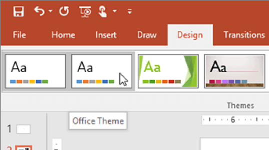
Note: To be sure that the colour you are using is accessible with appropriate contrast, you can use Microsoft Office themes instead of creating a custom theme. If you are creating a custom theme, you should check the colours you select with online tools such as a colour contrast checker.
Give every slide a unique title
People who are blind, have low vision or have reading disabilities rely on slide titles to navigate through the presentation. With a screen reader, they can easily skim all the slide titles and select the slide that they want.
To create slide titles, take the following steps:
- To restore all placeholders for the selected slide, on the Home tab, in the Slides group, select Reset.
- On the slide, in the Title box, type a unique name.
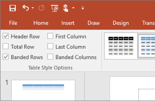
Structure tables for easy navigation
Screen readers keep track of their location in a table by counting table cells. If a table is nested within another table or if a cell is merged or split, the screen reader loses count and can’t provide helpful information about the table after that point. Blank cells in a table could also mislead someone using a screen reader into thinking that there is nothing more in the table.
To make a table accessible, take the following steps:
- Position the cursor anywhere in a table.
- On the Table Tools Design tab, in the Table Style Options group, select the Header Row check box.
- Type in the column headings.
Use larger font size and sufficient spaces
“People who have dyslexia describe seeing text ‘swim together’ on a page (the compressing of one line of text into the line below). They often see text merge or distort.” ¹
Note: For people who have dyslexia or have low vision, reduce the reading load. For example, they might benefit from familiar sans serif fonts, such as Arial or Calibri. Avoid using all capital letters and excessive italics or underlines. Include ample white space between sentences and paragraphs.
Avoid repeated blank characters
Extra spaces, tabs and empty paragraphs may be perceived as blanks by people using screen readers. After hearing “blank” several times, those users might think they have reached the end of the information. Instead, use formatting, indenting and styles to create whitespace.
Try to use text format in the Home tab for creating accessible slide. You can also can use the pre-built slide templates.
Avoid image watermarks
Images used as watermarks may not be understood by people with vision or cognitive disabilities. If you must use a watermark, make sure that the information it contains is also included elsewhere in your document.
Use closed captions for audio and video
If you use additional audio or video components in a document, ensure that the content is available in alternative formats for users with disabilities, such as closed caption, transcripts or alt text.
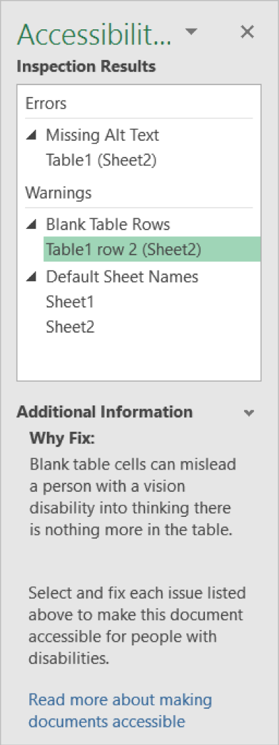
Use the Accessibility Checker
Just as a spelling checker identifies possible spelling errors, the Accessibility Checker in Word, Excel, and PowerPoint identifies possible accessibility issues in your Office file so you can fix these issues and make your content accessible to someone with a disability.
The Accessibility Checker checks your file against a set of possible issues that people with disabilities might experience in your file. Each issue is classified as an Error, Warning or Tip.
- Error: An error is for content that makes a file very difficult or impossible for people with disabilities to understand.
- Warning: A warning is for content that in most cases, but not all, makes a file difficult for people with disabilities to understand.
- Tip: A tip is for content that people with disabilities can understand, but that might be better organized or presented in a way that would improve their experience.
Fixing some issues might require you to change, reformat or update your content. The Accessibility Checker also lets you know about Office features you can use to make your content more accessible.
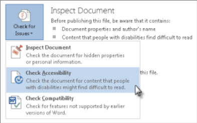
Generating an accessibility report
- Click File and then Inspect Presentation.
- If the Accessibility Checker sees any potential issues, you will see a message next to the Check for Issues button.
- To view and repair the issues in your file, click Check for Issues > Check Accessibility.
- Click a specific issue to see Additional Information and the steps you can take to change the content.
Correct all errors listed in the report
IMPORTANT: It is strongly recommended that you correct any errors the Accessibility Checker finds. It is also recommended that you add alt text in the PowerPoint document instead of the PDF version, so as to facilitate the updating of the alternative version. Generate the report until there are no errors left.