Always give a page a proper hierarchy
Accessibility
Using clear headings helps make web pages easier to use for people who rely on screen readers or other assistive tools. Headings act like signposts, showing how the page is organized and helping people move around quickly.
Reason
People don’t read every word on a page—they scan to find what they need. Headings give structure to the content so users can quickly understand what’s on the page and where to go next. Assistive technologies also depend on headings to help users jump between sections.
Best practice
- Use one main heading (H1) for the page title. (We do this for you in the template)
- Break content into sections with headings (H2, H3, etc.).
- Keep headings short and clear so people can scan them.
- Follow a logical order (don’t jump from H1 to H3).
- Make sure each heading matches the content that follows.
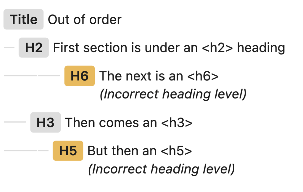
Example of poor practice
Poor practice includes a page uses headings out of order or skips levels.
Additional benefits
Clear headings don’t just help with accessibility—they also improve how people interact with your content overall.
Usability
People can quickly scan the page and find what they need without reading everything. This reduces frustration and saves time.
SEO
Search engines use headings to understand what your page is about. Clear, well-structured headings can help your content show up in search results.
Marketing
Well-organized content keeps people engaged and makes it easier for them to take action, whether that’s reading more or completing a task.
What WCAG says
“The objective of this technique is to ensure that sections have headings that identify them… authors should use headings that are properly nested.”
Pro tip
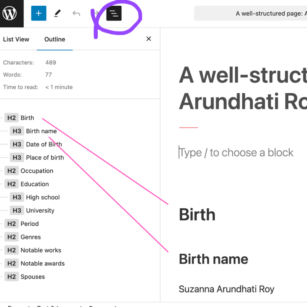
You can view the structure of the page in cuTheme. When editing a page or post, click on the Document view icon in the top left. It is a black square with three white lines on it. Next click on the Outline tab. You will see something that looks like this: