Alt Text 1: Improving your Image with Web Services
Let’s discuss the subtext
Before you get too excited this story isn’t about how to run a great PR campaign or mend your reputation after those photos get leaked to the press. When we say improving your image, we mean we are going to look at how to improve the accessibility of images on your website using alt text.
The five Ws of Alt Text
First things first: it’s pop quiz time – let’s try the five Ws (What? Why? How? When? and Who?) about alt text. (Relax: I have provided the answers for you.)
What?
Alt text is the little description of a picture that you can hear read to you when browsing a web page using an assistive technology called a screenreader. (It also appears in place of an image when the image is missing or hasn’t loaded.)
Why?
To enable people with visual disabilities to hear what the content of a picture is.
How?
You can add the piece of text to the image in the media library of your website.
When?
When the image has something that warrants description.
Who?
You probably think the ‘Who’ is users who have visual disabilities – but, yes sorry, it was a trick question because everyone benefits from accessible images!
Let’s move on swiftly from the unfairness of that trick question, to see what we mean by ‘everyone benefits from alt text.’
We put the ‘text’ into ‘context’
Alt text on images serves three functions:
- It allows users with visual disabilities to hear the content of the image described to them
- It allows other users to read something about the content of the image if the image fails to load with the rest of the page
- It allows search engines like Google to index pages in a much more efficient manner
These functions make it even more important to make sure you have well-crafted alt text for your images.
Let’s look at the When? again
What does it mean when we say the ‘When’ of alt text is “when the image has something that warrants description”? A good practice to adopt with alt text is to always consider the context of the image. Let’s take a look at this image:
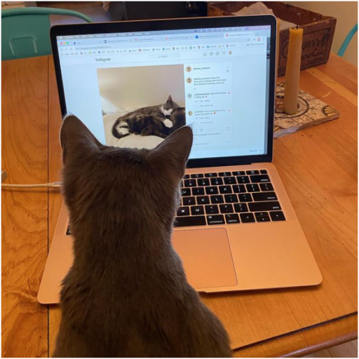
Now imagine this picture is used on a page that gives very general information about cats. This picture seems very relevant to the page content because it contains a picture of – spoiler alert – a cat. Alt text might be a grey cat in front of a computer.
Let’s ask ourselves two questions:
- How this will seem to a person using a screen reader? and
- Is their experience improved by knowing there is a picture of a grey cat on this page?
They are listening to information about cats and that is interrupted for them to hear the words “Image: a grey cat in front of a computer.” In reality, it adds nothing to their experience or education to know that. This is a decorative image and in this situation, we would be correct in not assigning it any alt text.
But now imagine a different scenario wherein the picture is used on a different page, this time describing research into whether or not a cat can be convinced to look at a computer screen.

If the user reads – or has read to them – the proposition that a cat can be persuaded (possibly by convincing them they are helping science but more likely with the promise of treats) to look at a computer screen then the context becomes completely different. Now this image is illustrative – it is demonstrating something to the user, and the user should know what the picture shows whether they can see it clearly or not.
These two examples, featuring the same image in different contexts, go a long way to show both the difficulties that accompany the use of alt text and the way to think about images to help solve these difficulties.
You can check through your sites to see if you think your team has been employing alt text correctly, and consider whether where to add/change/delete alt text if required.
If you want to read more we really recommend reading this article about alt text from some of the world leaders in the field, Accessibility in Mind.