Getting the Most Out of Google Analytics: Using Your Timeline
Google Analytics is a valuable tool that can really really really (really!) help you improve your website.
Your analytics reports can answer questions like, how many people are reading your content? How much time are they spending on a page (meaning, are they reading your content)? What vehicles are working for you? Where are your opportunities for improvement?
In this new series of posts I will help you navigate your analytics reports and find answers to the questions above, and more.
Let’s begin with your timeline.
(If you don’t have access to your analytics report, send an email to its.service.desk@carleton.ca and we’ll get you sorted.)
Accessing Your Timeline
Your timeline is simply a graph showing stats within the timeframe you select.
To access your timeline and select dates:
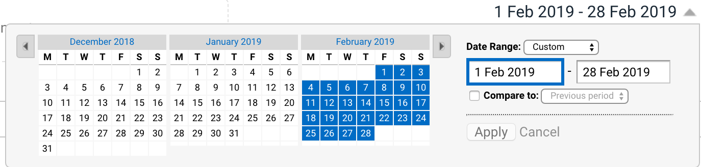
- Click on any report from the left hand side (such as Audience -> Overview).
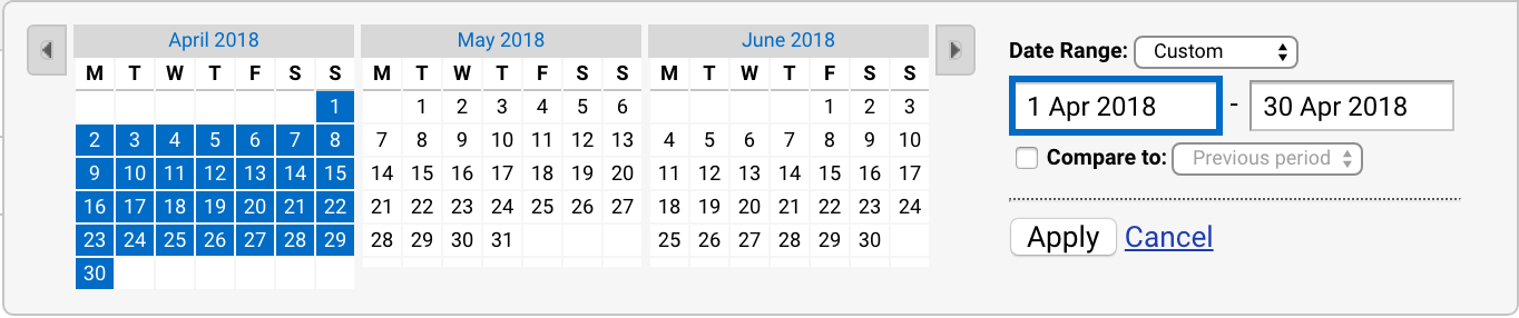
You’ll see a date on the upper right hand side of your screen. - Click on the arrow next to the date to open the calendar.
- Select the dates by clicking directly on the calendar.
Now that you know how to access your timeline, here are two things you can do with it:
1. Compare to past.
Let’s say in February you had 3,443 users visit your website. Is that good? Is that bad? The only way you will know is if you compare it to how your website did at that time last year.
Comparing to past will tell you if you’re up or down from last year and by what percentage.
To compare to past:
- Enable the Compare to: button.
- Select Previous Year.
- Click Apply.
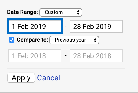
Your timeline will then change to show blue (this year) and orange (last year) lines.
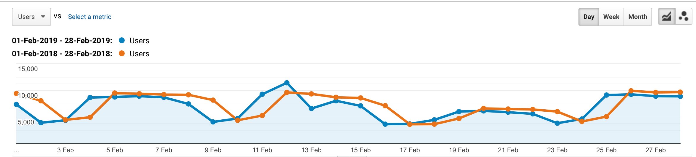
Below that you will see how you did compared to last year. If there’s a big discrepancy in any of the stats you can then ask questions and learn more about user behaviour.
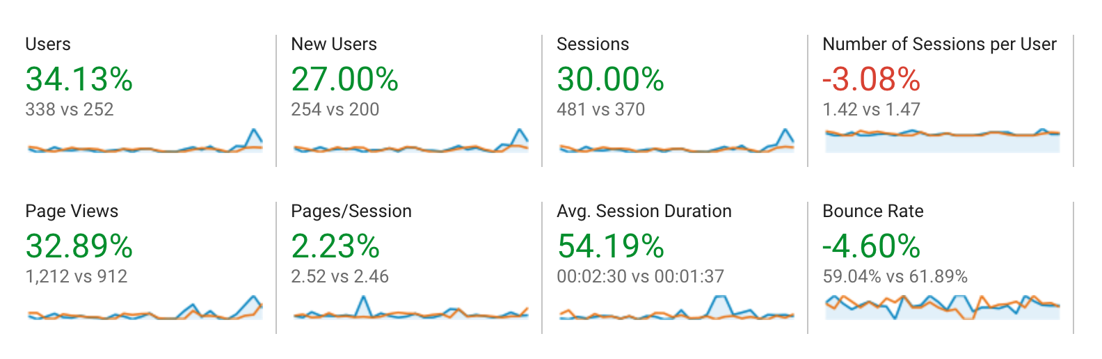
Above are the stats from our Web Services website. As you can see, we’ve greatly improved from last year – and do you know why? (I do! I do!) It’s because we dusted off our newsletter and started sending it out again.
Now, your numbers may not be so obvious.
To get more insight, click around different reports. For example, check out your traffic sources report (click Acquisition -> All Traffic -> Channels) – maybe you started a Facebook account and social is up? Optimized your site for search engines? Had some posts promoted in the Intranet? This is super helpful in figuring out whether or not your communications efforts have been successful.
To stop comparing to past, simply click on the arrow next to the date again and de-select Compare to.
2. Look at what pages people were visiting last year.
Use your timeline, again, to view stats from the past – this will give you an idea of what could be coming up in the month ahead. It’s March now, so you’d want to look at April 2018. Chances are the pages that people were interested in last year at this time will be the same pages they’re interested in this year.
To view past dates, navigate through the months on the calendar and select the timeframe you want and click Apply.
You can then go into your behaviour reports (Behaviour -> Overview) and see what pages people were looking at last year. Use that information to fix up those pages and make sure they’re easily accessible – maybe you can add it to your homepage quick links, write a news post, or promote those pages in appropriate channels.
Want to learn more?
If you want to learn more about Google Analytics, you’re welcome to attend our workshop on March 18 – if you missed this one, don’t worry we’ll be doing it again in the future. We’re also doing a Writing for Accessibility workshop on April 15th, and I will more than likely talk about analytics at some point during that session. There are also some really great sessions on Lynda.com which you can access for free using your Carleton credentials.
And again, if you don’t know how to access your analytics reports, just send an email to its.service.desk@carleton.ca and we’ll help you out!