Creating accessible Word and PDF documents – PC users
Because many files are often viewed electronically, governments, universities and industries around the world are implementing policies that require electronic and information technology to be accessible to people with disabilities. The Government of Canada and province of Ontario have a vision for completing WCAG2 level AA (other than criteria 1.2.4 [live captions] and 1.2.5 [pre-recorded audio descriptions]) by January 1, 2021¹. The information below offers guidance on ways to create Microsoft Word documents so they are more accessible to users with disabilities.
WCAG 2.0 Guidelines
WCAG (Web Content Accessibility Guidelines) is an international standard for web accessibility. W3C (World Wide Web consortium), a team of experts, is responsible for developing these standards. Users can follow WCAG standards to create an accessible document for different users¹.
WCAG has, in general, 12 guidelines that are organized under four principle areas:
- Perceivable: Information should be perceivable by the user. It cannot be invisible to any users.
- Operable: The user interface component and navigation must be operable. The user should be able to operate the interface. In other words, the interface should not require any type of interaction that the user cannot perform.
- Understandable: The content should not be beyond the understanding of the user. This means that user should understand all the information and operation techniques.
- Robust: The user should not lose access to the content as technologies advance. In other words, as technologies and users evolve, the content should remain accessible.
Levels of web accessibility
In general, documents should meet one of the three levels of accessibility (A, AA, AAA). Upon initial completion, documents should meet level A. After that, content managers should refine the document to meet level AA¹. Find our more about the accessibility levels here.
Note: At this time, meeting level AAA is not required for the EDC.
There are some important issues that should usually be considered when an instructor, staff member or course designer creates Word or PDF documents. Some of the most common issues are listed below:
- Add alternative text to images, objects and tables
- Specify column header and rows in tables
- Use set styles in a long document
- Use short titles in headings
- Ensure all heading styles are in the correct order
- Use meaningful hyperlink text
- Use simple table structures
- Avoid using blank cells in tables for formatting
- Structure the layout of tables for easy navigation
- Avoid using repeated blank characters
- Avoid using floating objects
- Avoid image watermarks
- Include closed captions for audio
Add alternative text to images and objects
Alternative text, also known as “alt text,” appears when you move your pointer over a picture or object; it sometimes also appears as a title. Alt text helps people who use screen readers understand the content of images in your document. For many readers, this is the only information they have about the images and objects in a document. Alt text should be included for any of the following objects:
- Pictures
- Clip Art
- Charts
- Tables
- Shapes (that don’t contain text and are not in groups)
- SmartArt graphics
- Groups (all objects in this list, with the exception of shapes, should also have alt text when in groups)
- Embedded objects
- Ink (i.e., using the drawing freehand tool to make annotations in Word. Find out more about drawing with Ink in Office here)
- Video and audio files
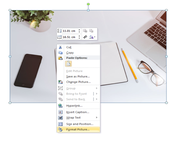
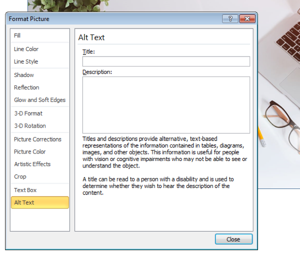
To add alt text to images, take the following steps:
- Right-click the image or object, and then click Format Picture/Format Shape (for tables, click Table Properties).
- Select Layout and Properties. Click Alt Text.
- Enter a description of the image or object into the Description text box. Use clear but concise descriptions. For example, “a red Ferrari” tells the reader more about the image than “a car.”
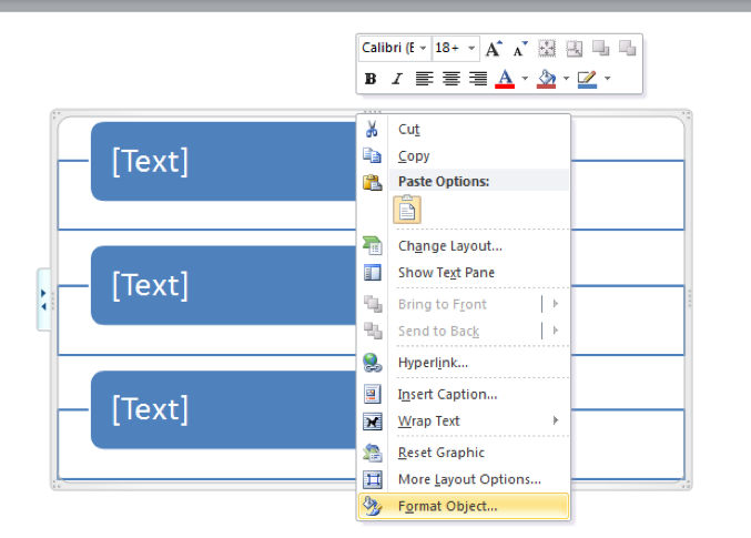
Adding alt text to SmartArt graphics
- Right-click a SmartArt graphic
- Select Format Object
- Select Alt Text
- Type a Description and Title
- Click Close
Adding alt text to text to shapes
- Right-click a shape
- Select Format Object
- Select Alt Text
- Type a Description and Title
Adding alt text to charts
- Right-click a chart
- Select Format Chart Area
- Select Alt Text
- Type a Description and Title

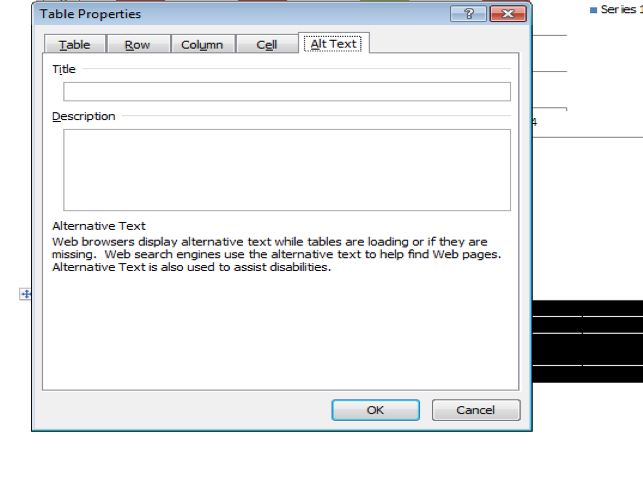
Adding alt text to tables
- Right-click a table
- Select Table Properties
- Select the Alt Text tab
- Type a Description and Title

Specify column header rows in tables
In addition to adding alt text that describes the table, having clear column headings can help provide context and assist navigation of the table’s contents.
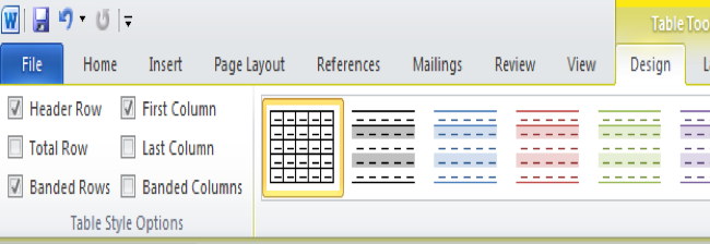
To specify a header row in a table, take the following steps:
- Click anywhere on the table
- On the Table Tools pane, click the Design tab, then select the Header Row check box
- Add your header information
Having the header row repeat across the pages of the document is extremely important. Whenever a table appears in two or three pages, it is necessary that the header row repeats so the information on each column is clear to learners.
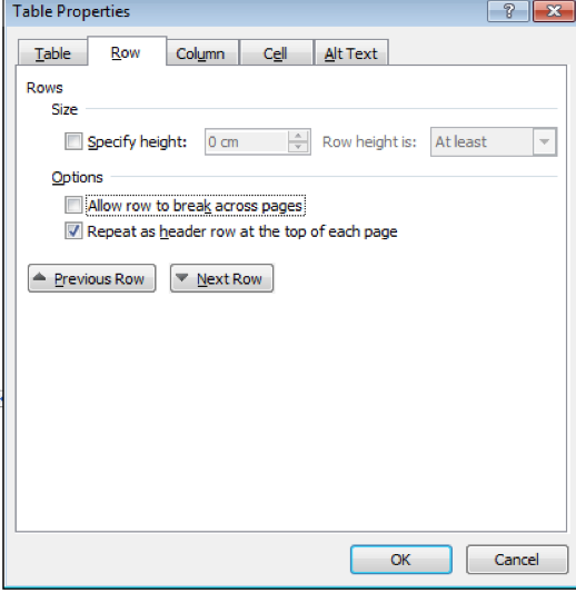
To repeat the header row information from a table across pages, take the following steps:
- Right-click the header line on the table
- Click Table Properties
- Select the Row tab
- Check the text box Repeat as header row at the top of each page
- Click OK
Use styles in long documents
Heading and paragraph styles, as well as tables of contents (used when necessary), make it easier for all readers to follow documents more easily. In longer documents, these elements can add structure for users who are using a screen reader, or who rely on the visual cue of section headings to navigate as they read.
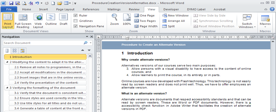
Using the Navigation pane in Word lets you browse the document by headings.
To apply heading styles to your document, take the following steps:
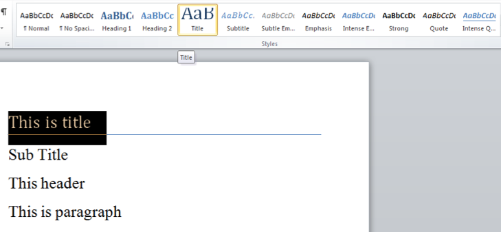
- Select the text you want to make into a heading
- On the Home tab, in the Styles group, select the appropriate level heading style from the Quick Styles. You can also create your own heading and paragraph styles
Use short titles in headings
When using headings in a document, be sure to keep them short (fewer than 20 words). In general, headings should be, at most, one-line long. This brevity makes it easier for readers to quickly navigate the document, either by scanning it, or by using the Navigation pane.
Ensure all heading styles are in the correct order
By using heading levels in a logical order (for example, Heading 4 is a “child” of Heading 3 and not Heading 2), we can assist users in navigating the document and finding information.
To change a heading style, take the following steps:
- Place the cursor on the heading that you wish to change
- On the Home tab, in the Styles group, choose the appropriate heading style
To add a heading line, take the following steps:
- Insert a line of text where you want the new heading
- On the Home tab, in the Styles group, choose the appropriate heading style
Note: Make sure you use headings in logical order. For example:
Heading 1
Heading 2
Heading 3
Heading 4
Heading 5
Heading 6
You can view and update your document’s organization by clicking the View tab in the Show group, and/or by clicking the Navigation pane check box. To help maintain clear navigation, make sure you have at least one heading about every two pages, and confirm that your headings are in the correct order (Heading 2 under Heading 1, etc.).
Use meaningful hyperlink text
Hyperlink text should provide a clear description of the link destination instead of only providing the URL. Use contextual information and avoid using non-meaningful titles.
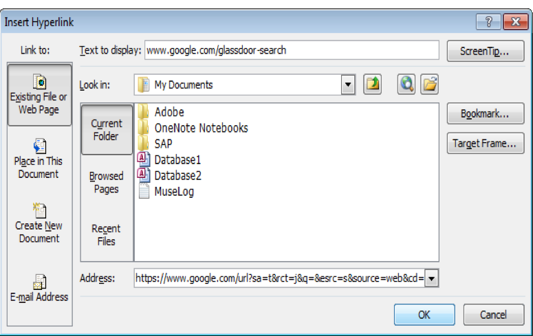
To add a hyperlink to your document, take the following steps:
- Place your cursor where you want the hyperlink to be
- On the Insert tab, in the Links group, click Hyperlink to open the hyperlink dialog box
- In the Text to display box, type in the name or phrase that will briefly describe the link destination.
- In the Address box, type in the link URL (or simply copy and paste the URL)
- Click OK
To change the text of a hyperlink, take the following steps:
- Select the link and then, on the Insert tab in the Links group, click Hyperlink to open the Hyperlink dialog box
- In the Text to display box, make any necessary changes to the text
- Click OK
Additionally, you can include ScreenTip text that appears when your cursor hovers over a hyperlink, and it can be used in a similar way to alt text. To add ScreenTip text, take the following steps:
- Place your cursor in the hyperlink you want to add ScreenTip text to
- On the Insert tab, in the Links group, click Hyperlink to open the Hyperlink dialog box
- Click ScreenTip
- Type in your text in the ScreenTip text box
- Click OK
Use simple table structures
By avoiding nested tables and merged or split cells inside tables, you can make the data predictable and easy to navigate. For example, when you are designing a form, the entire document is often based on a heavily formatted table, which makes it very difficult for users to navigate with a screen reader. A document formatted in this way requires such readers to piece together the content of each cell, and/or to read the information in an unpredictable order in order to get an idea of the form’s content.
Avoid using blank cells for formatting
Using blank cells to format your table could mislead people using a screen reader, making them think that there is nothing more in the table. You can fix this by deleting unnecessary blank cells.
Structure layout tables for easy navigation
If you use a layout table (table with Table Normal style), check the reading order to be sure that it makes sense (for English: left to right, top to bottom).
Verify the table reading order by tabbing through the cells to check that the information is presented in a logical order.
Avoid using repeated blank characters
Extra spaces, tabs and empty paragraphs might be perceived as blanks by people using screen readers. After hearing “blank” several times, those users might think that they have reached the end of the information. Instead, use formatting, indenting and styles to create whitespace.
To use formatting to add whitespace around a paragraph, take the following steps:
- Remove any existing whitespace around the paragraph
- Select the text, then right-click and choose Paragraph
- Select values for Indents and Spacing to create whitespace

Avoid using floating objects
Objects that are not in line with the text are challenging to navigate, and they may be inaccessible to users with vision impairment. Setting text-wrapping around objects to Top and Bottom or In Line With Text makes it easier for people with screen readers to follow the structure of your document.
To change the text-wrapping around objects, take the following steps:
- Select the object and right-click
- Choose Wrap Text, and then select either In Line with Text or Top and Bottom from the list
Avoid image watermarks
Watermarks are images that are “put into” a page when it is created, and which can only be seen if the paper is held up to the light. Historically, publishers and printers have used them, and most governments today continue to use them for, for example, currency. Digital watermarks are something similar – they are images that appear in the background of a document.
Images used as watermarks in digital documents may not be understood by people with vision or cognitive disabilities. If you must use a watermark, make sure that the information it contains is also included elsewhere in your document.
Include closed captions for audio
If you use additional audio components in a document, ensure that the content is available in alternative formats for users with disabilities, such as closed captions, transcripts or alt text.
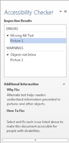
Using the Accessibility Checker in Word
Just as the spelling checker tells you about possible spelling errors, the Accessibility Checker in Word, Excel and PowerPoint tells you about possible accessibility issues in your Office file so you can fix these issues and make your content assessible to someone with a disability.
The Accessibility Checker checks your file against a set of possible issues that could be an obstacle for assistive technology to read. Each issue is classified as an error, warning or tip.
- Error: An error is for content that makes a file very difficult or impossible for people with disabilities to understand
- Warning: A warning is for content that in most cases, but not all, makes a file difficult for people with disabilities to understand
- Tip: A tip is for content that people with disabilities can understand, but that might be better organized or presented in a way that would improve their experience
Fixing some issues might require you to change, reformat or update your content. The Accessibility Checker also lets you know about Office features you can use to make your content more accessible.
Generating an accessibility report
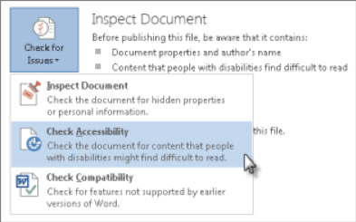
- Click File > Info
- If the Accessibility Checker sees any potential issues, you will see a message next to the Check for Issues button
- To view and repair the issues in your file, click Check for Issues > Check Accessibility
- Click a specific issue to see Additional Information and steps you can take to change the content
Correct all errors listed in the report
IMPORTANT: It is strongly recommended that you correct any errors the Accessibility Checker finds. It is also recommended that you add alt text in the Word document instead of the PDF, so as to facilitate the updating of the alternative version. Generate the report until there are no errors left.
Converting a Word document into a PDF
To convert a Word document into a PDF, you must have Acrobat Writer Professional installed on your computer (not Acrobat Reader). If Acrobat Writer Professional is installed on your computer, you will see the “Acrobat” tab in your ribbon.
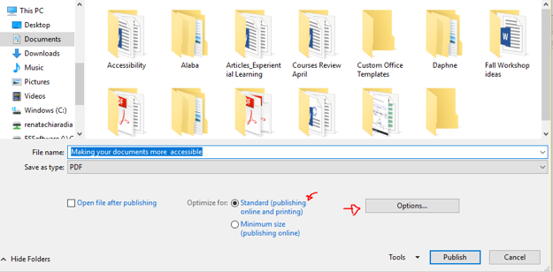
If you do not have Acrobat Writer Professional on your computer, take the following steps:
- Click File on the ribbon
- Then select Export
- Click Create a PDF/XPS Document
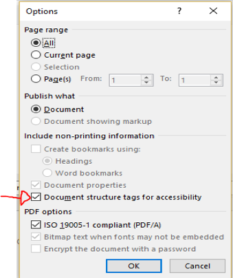
- Choose Standard in the Optimize for section, and then click Options
- Make sure the option Document structure tags for accessibility is selected, and then click OK
- Finally, click Publish
Generating an Accessibility Report in Acrobat
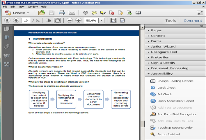
Acrobat Writer Professional can check the accessibility of your document and generate a report listing all accessibility problems. To generate this report, take the following steps:
- Open the PDF document for which you want to check accessibility
- In Tools, in the Accessibility tab, click on Full Check
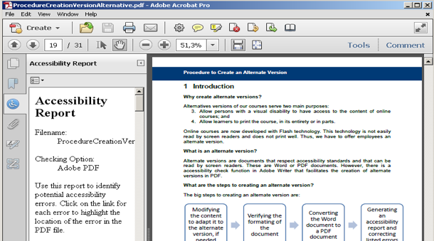
- Open the accessibility report
- Correct all accessibility errors. The most common errors are:
- Text or pages with no language specification
- Tab order that may be inconsistent with the structure order
- Figure elements with not alternate text
- Text or pages with no language specification. To quickly correct this error for all pages simultaneously, go to the File menu and click on Properties. In the Reading Options box, choose the document language, and then click OK.