Accessibility is for Everyone
Accessibility has become a bit of a buzzword in recent years, and, as with the names of many crucial initiatives and endeavours when they become used commonly, their importance can be diminished. So it is sometimes a useful exercise to loop back around and remember why something like accessibility is a crucial aspect of work we all do on campus, and why Web Services makes accessibility a key priority in building websites here at Carleton. We think this is also a great opportunity to tell you why it is we ask you to do certain things when it comes to creating content for your websites.
What is accessibility about?
When we talk about accessibility, many people think of physical barriers (and their removal). Websites are really no different. As website builders and content creators, it is our responsibility to make sure, for example, that
- people can see the text on the page (or hear it if they use a screen reader to assist their browsing),
- they can understand what an images contains (if any visual impairment stops them from discerning this in the way we might usually expect),
- they can browse between and interact with items on a page (such as hyperlinks if they have a physical limitation).
Creating an accessible website can be aided with something as simple as making sure the colour of the text is in clear contrast to the background colour of the web page.
Accessibility and AODA
So how do we make sure our sites are accessible? Luckily, we do have some guidance and help from the AODA legislation and documentation. In Web Services we don’t start off with the aim of meeting all the criteria of provincial legislation; instead our goal is to make our web templates and content as accessible as possible to the greatest number of people; this will, coincidentally, meet all the AODA criteria.
How widespread are accessibility considerations?
Isn’t this a lot of work to help a minority of individuals with accessibility issues who access websites? According to research, the answer is 14%, which is surprisingly high. But, bear in mind, that number only reflects people registered as having a disability – that statistic doesn’t cover the number of people who suffer with issues and don’t report them. Also, you might be a person who, like me, one day needs reading glasses to read web content. If you are placing text on your site that is tiny you are excluding not only people who are registered as legally visually impaired; you are also excluding almost everyone who is middle-aged or older!
Two aspects to consider
When it comes to the web at Carleton, there are two general things we have to consider: the template and the content. The template is the responsibility of Web Services. We have developed a template that maximises, to the best of our ability, people’s power to access and navigate the websites placed in this template. Content is all about you! Once we hand a website over to the people who administer it and maintain its content, the responsibility becomes theirs to insure what is placed in the site is as accessible as possible.
Examples of good practices
So, why do we ask that you do certain things on your sites and not do others? Let’s look at two great examples.
Compare and contrast
We are often asked by website maintainers how to change the colour of a piece of text on a web page. As a for-instance, people often want to make the text red to highlight it. This we discourage.
The standard text we use on all of our websites (which have white backgrounds) is black. There is, after all, a reason people say something is ‘black and white’ when they want to say two things are in complete contrast to each other. Different colours can stand in contrast to each other, but black and white are the best at helping us discern text from not-text.
If we want to get technical, there is a world wide standard for the colour contrast, determined by the poetically named WCAG 2.0 Contrast Ratio Formula. It is about as sexy as it sounds and it is a pain to understand but thankfully there are online tools that allow you to enter a text colour and a background colour to quickly see if the combination is accessible or not.
For instance, if you were to force red code into your CMS website, here’s what you get:
Brightness Difference: (>= 125): 178.755
Colour Difference: (>= 500): 510
Are colours compliant?
Contrast Ratio: 3.998
WCAG 2 AA Compliant: NO
WCAG 2 AAA Compliant: NO
The important indicator is that the WCAG 2 AA/AAA Compliances must be YES. Alas, they are both a big NO.
So ‘red’ (as defined by the color hex code of #FF0000) is inaccessible to many and non-optimal for almost everyone! This is why we ask you do not highlight text by changing the colour of the font. Instead there are any other options, for example, bolding text, using headings to highlight a new section on a page, etc.
Getting the word out there
Banners and other images can have a massive impact on your site. They can communicate brand, illustrate concepts and underline the meaning of your text – that is, to those with the visual ability to discern what is in the image and what it is trying to convey. When it comes to accessibility and images we employ different methods to make them partially accessible. For example, because screen readers (employed by those with visual impairments to speak web content to them) cannot decipher what is in an image we use alt text to describe the image.
But because of the nature of how an image works, this means a big no-no in web content is placing text on you images that is designed to convey a message. Consider this image:
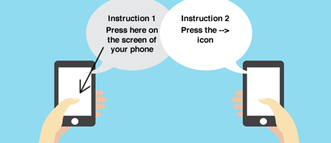
This is a classic example of why text on images is a bad idea. None of the text instructions on the picture would be apparent if scanned by a screen reader. If the instructions are nowhere else on the page then these instructions are lost. It is also a great example of ensuring your website is accessible benefits everyone: if the instructions were text then it would also be easily accessed by search engines such as Google. Also, if someone who doesn’t consider themselves sight impaired comes across the page when they don’t have their reading glasses on, they can enlarge text on the page; if they tried enlarging the image, the text becomes MORE blurred.
In conclusion
It is very important that our Carleton websites are accessible. Yes, we need to meet AODA standards (by law), but we want to provide a really great online experience for all. And that means understanding who our audience is, what barriers exist, and solutions to minimize those barriers. Your takeaways today are:
- do not change font colours – there are more accessible ways to emphasize your content
- do not put words on images – put the content below the image so that everyone gets the same experience
- use alt tags on your images – a screen reader will be able to relay to the user the context of the image
We’ll be talking a lot more about accessibility and easy ways that you can make sure your website is accessible. Make sure to subscribe to our newsletter to stay informed.
To learn more about the importance of accessibility, visit our self-guided accessibility training: