CuTheme Update: 7 Key Changes for Content Editors (Blocks)
In our latest efforts to get you pumped about our new cuTheme, we’re rolling out a seven-part blog series where we’ll be showcasing new features available with our updated theme.
This is our first post in the series, and to kick off, we’re covering a change you’re going to love: content blocks!
Post 1/7: Content Blocks
Content blocks are a new tool in WordPress that allows you to easily and intuitively build the content within your site.
Pretty much anywhere you add content, you use blocks. For example, you can have blocks for:
- Regular text
- Tables
- Images
- Listings
- Page Banner
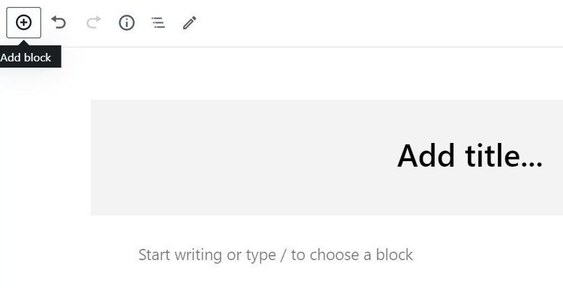
There are three ways you can create a content block. One is to click the little blue plus icon in the top left of your screen.

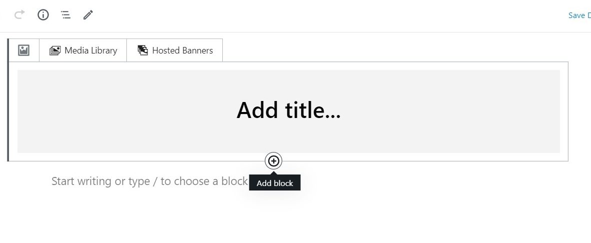
You can also create a content block by hovering over the place where your content block will be built and pressing the plus icon.

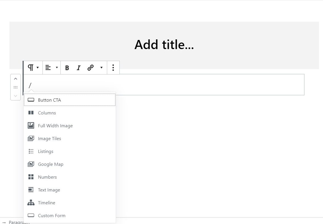
If you type “/” then the name of the block, this is another easy way to add a block to your webpage.

As blocks are added, they can be rearranged at any time by dragging and dropping them in the order you prefer.
Best Practices
The most common blocks you will use to create your content are: paragraphs, listings, text image, columns, and buttons.
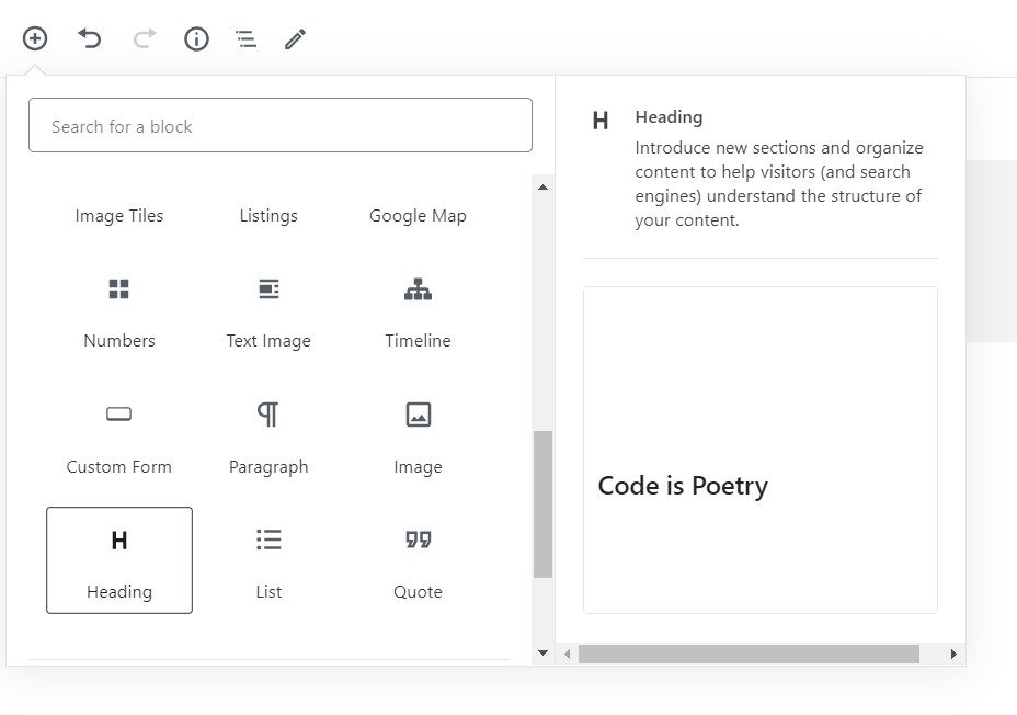
When deciding what block would best display your content, hover over each block option and the description of the block will tell you what the block is best used for.

Paragraph Block
A paragraph block is a text-only block used for adding most of the general content to your site.
When writing content in the paragraph block, it is important to remember:
- Use appropriate headings to organize your content
- Avoid the use of italics, as they are hard to read
- Never write in all capital letters, as this is not accessible
Following these tips will ensure your written content remains accessible and easy to read!
Text Image Block
The text image block is a great to use when adding visuals to your written content. The block is formatted so there is a preset place to add an image to a body of text. This eliminates the hassle of having to drag a photo around in a body of text trying to get it to look how you want.
Listing Block
The listing block allows you to pull content onto your page in the form of a listing. This block is where you can list your upcoming events, people profiles of your faculty, important pages, posts, videos etc.! Listings are a great way to add visual, interactive content to your webpage to engage your audience.
Column Block
The column block easily allows you to organize your content into two or more columns. This feature is nice because it doesn’t require any code and you can see exactly how the columns are going to look on the front end.
Button CTA Block
The button block makes it easy to add buttons anywhere on your webpage. It’s important to include a “call to action” on your pages to engage your audience and encourage them to take action on your site. It’s great to include buttons for important or popular content, like “contact us”.
Here are some tips when using buttons:
- Avoid using too many buttons on a webpage, this can overwhelm users
- Use intuitive, short names for the buttons
- Including one or two buttons on page banners is a great way to drive traffic to other areas of your website
All of this information, along with training videos, can be found on our new cuTheme help center. The help center covers all the features of cuTheme, best practices, and accessibility rules. Be sure to check it out!
If you want to learn more about the new cuTheme and see what it looks like, check out the coffee break recap!