Things You’ll Love About CuTheme
Here in Web Services, a lot of work is going into the moving our 660+ websites to the new cuTheme template. This new template comes with many changes to the layout on both the frontend (new content blocks! new functionality!) and backend (hello new WordPress Gutenberg editor) of our websites.
We understand that change can be scary and we don’t always have the time to learn new things, but the new format on cuTheme is much simpler to navigate than the previous ones and has many added benefits.
Editing Experience
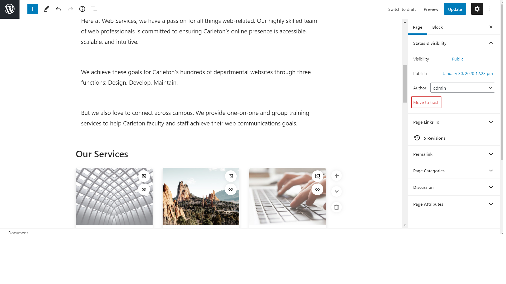
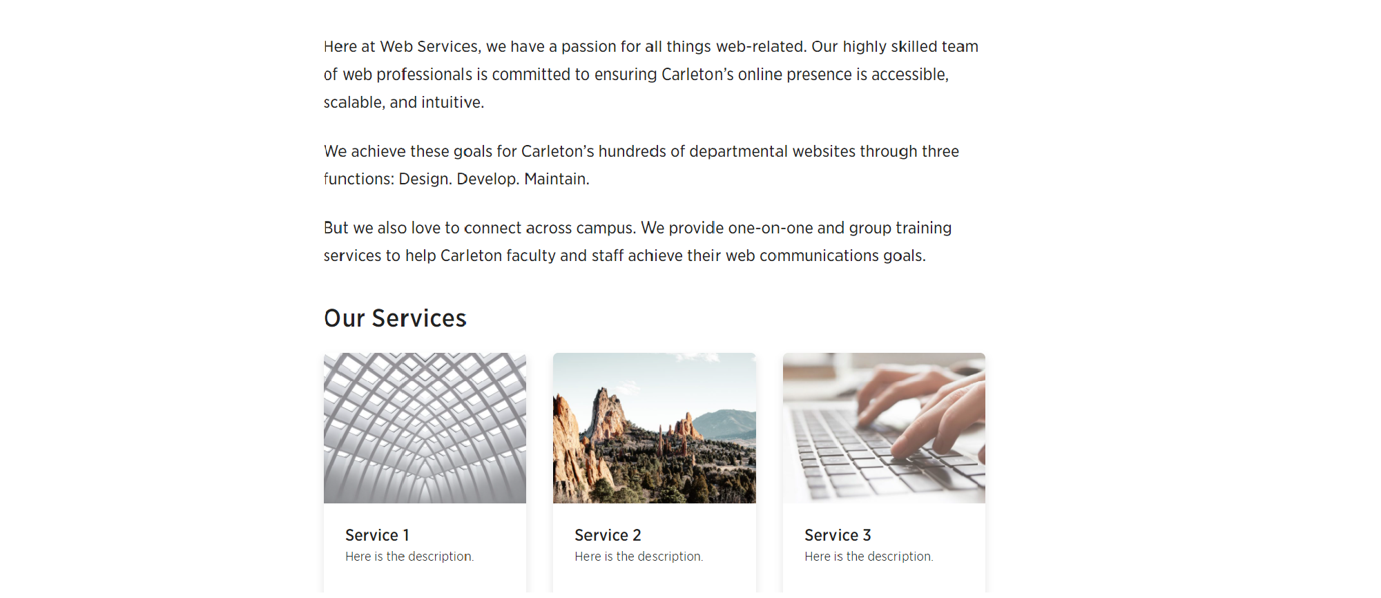
One main difference with cuTheme is the improved editing experience. For editors, the backend of the websites looks exactly like the front published end. (The backend of a website is where the editing and configuration happen that brings a website to life.) Basically, you can see exactly how your changes will look, without having to view or publish the page.
Below is an image of the back end of a web page:

Here is the the front end of the page:

Here we see that the front end and backend of this site look identical. This makes it easy for you to visualize the page from the backend. You are able to edit the individual blocks of text, images, or other content this way.
Intuitive
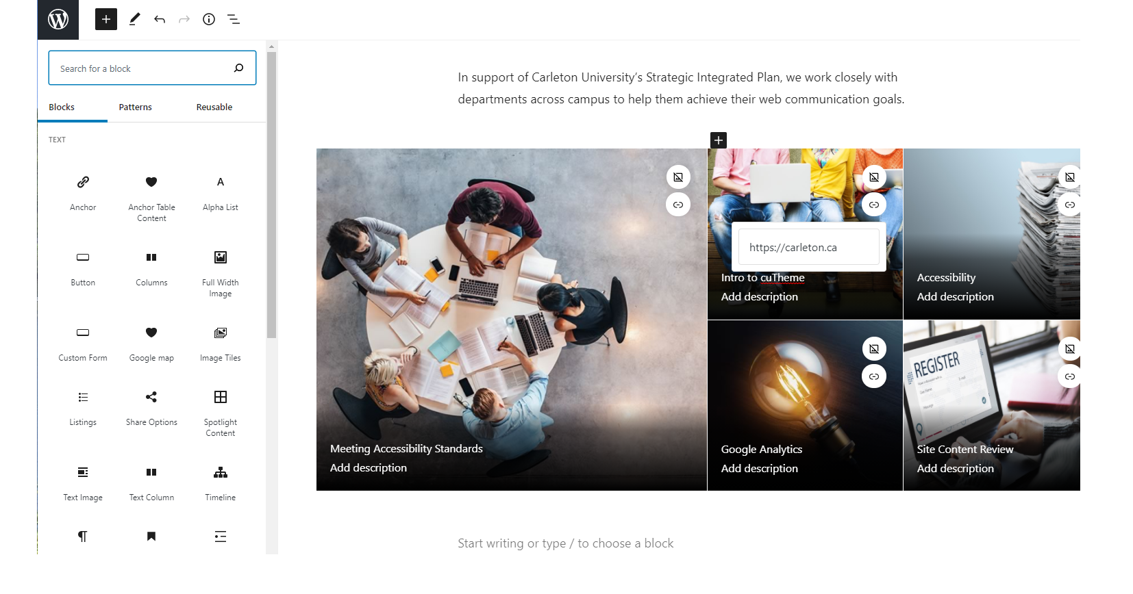
The new cuTheme in Gutenberg is very intuitive. With the new block system you can easily add new information and a new layout to different pages. The top navigation menu displays options to add new blocks, undo or redo actions, content structure, and navigation. The image below shows the left-hand menu. This allows you to configure each specific block or the whole page. Once you have picked up the basics of adding blocks, you’ll find you have much more flexibility to display your content.

In WordPress, there can be a lot of going back and forth in the backend. Creating a post, editing it, publishing it, creating a page, adding the newly edited post to that, publishing that. With Gutenberg, the elements and blocks can be added right to a page. As well as being to add categories, you will be able to add individual posts from different categories.
Accessibility
The accessibility of cuTheme has improved from the previous template. There are still functions on readability, as well as limits to appearance changes to maximize reader accessibility to the pages.
Appearance
The new cuTheme design layout is even more visually appealing. WordPress’s clunky and dated backend layout is more confusing and requires more instruction. Gutenberg has a sleeker and more modern design for the editor. Also, in cuTheme, any element that can be used on the homepage of your site can be used on ordinary pages too!
When it comes to changing the layout of blocks, adding backgrounds, adding content, and other features, there is more ability to customize the visual aspects of a page or a post for your website in this theme.
So When is it Available?
We know that’s what you’re asking and we will be announcing the rollout plan soon. We are waiting on our new server environment, but in the meantime we continue to work on the theme, doing tons of testing and QA and adding new blocks. We’ll have more to tell you in our next newsletter, so stay tuned!