Web Writing Crash Course: 3. Structure
Welcome back to the Web Writing Crash Course, where we share tips on how to write enticing web content.
Did you know that the way you structure your content can greatly affect scannability and accessibility? In this issue, we will go over some tips to make your page as scannable and accessible to your audience as possible!
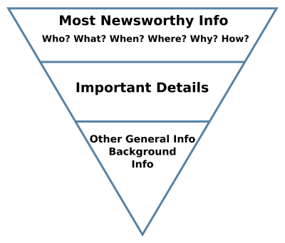
Structure Tip #1: Structure your content into an “Inverted Pyramid”

In other words, place the most important information at the top, followed by less important information.
There are a few benefits to doing this:
- Having the main point(s) in the first sentence or paragraph tells your visitors whether the page has the information they are looking for.
- As the most valued information is at the top, visitors can get the main idea without scrolling through the entire post.
For example, if your page is about an event, key information such as event name, date and location should be displayed at the top of the page. Supporting details such as event description and registration information would follow. Less important information such as event organizers and additional resources can be listed at the bottom of the page.
Structure Tip #2: Have a clear Call to Action
Ending a web page with a clear call to action (CTA) lets the audience know what they need to do next. Do you want them to contact someone for more information? How about registering for an event or reading related blog posts?
A common practice is to have the CTA at the end of the page, after the Inverted Pyramid. When crafting your CTAs, go for short and succinct expressions that start with action verbs, such as “Apply”, “Contact Us” or “Read More”. On Carleton CMS, you can make your CTA stand out by adding a button on your page!

Structure Tip #3: Write short, focused paragraphs
Try to stick to only one idea per paragraph. This will keep your paragraphs short and easier to scan. The recommended paragraph length is 50 words.
Breaking a big block of text into smaller paragraphs will also create white space around your text, allowing your readers to “breathe” and reorient themselves while going through your post.
Structure Tip #4: Use Headings
If your post has many paragraphs, it is useful to divide them into sections using Headings.
Headings help readers quickly scan your content and identify which section of the post is relevant to them. Additionally, Carleton CMS and cuTheme automatically generate a table of contents based on your headings, which aids site visitors to navigate your content.
When creating headings, make sure they are:
- Short and concise – The recommended length is 64 characters or less.
- Descriptive and relevant to the section content – If you were a visitor to this page, would you expect to find this information under this section heading?
- Nested under a heading 1 level higher – For example, a Heading 4 should not be nested in a Heading 2, as this is not good for accessibility.
And those are our tips on how to structure your content. We’ll see you next week with some formatting tricks to make your page more interactive and engaging!