What’s on the Menu? Tips for Building Effective Website Navigation
Imagine your website as a nice restaurant. You seat your visitors at your homepage and hand them a menu, leaving them to navigate it on their own. If the menu is unclear, overwhelming, or missing the tools to help them find what they are looking for, you risk your visitor getting up and leaving!
In a series of miscellaneous mixed menu metaphors that run the risk of making you quite hungry (and not just for website improvement!), we’re going to show you how to fix up your website’s menu.
If you’re in a rush, however, and looking to dine and dash, you can skip ahead to the last section, “Bon Appetit” and read the core steps of this article as a simple 5 item list.
The Mise en Place: Organizing your Navigation Menu
You may have heard of a hamburger menu – a dropdown menu represented by three horizontal lines – but here we are building a new type of hamburger menu. It is a hamburger, separated into menu items to illustrate how to improve your menu structure.
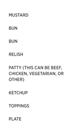
Here is an example of a not-so-great menu listing parts of a hamburger:
- Mustard
- Bun
- Bun
- Relish
- Patty (this can be beef, chicken, vegetarian, or other)
- Ketchup
- Toppings
- Plate
Ordering (from) the menu
What’s wrong with this website menu? Well, for starters, the items aren’t in any sort of coherent order. When ordering your menu, you want to have it logically organized, and take advantage of the primacy and recency effect. The primacy effect tells us that people tend to remember the first couple items in a list (the first being most memorable, the second less so, and so on), while the recency effect suggests that the most recent item read (usually the last in a list, unless the user’s reading style is somewhat unusual) also sticks in the reader’s memory.
Using this cognitive cheat code, you’ll want to put your most important item at the top of the menu, followed by your second most important item and so on, with the last item as something you also want people to remember. In our example above, the reader may come away from the menu remembering only mustard, a plate, and maybe a bun or two. Not exactly ideal if you want them to picture a hamburger.
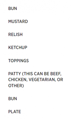
“But what about organizing the middle of my menu?” You may be asking. Luckily, I have pre-emptively heard you and answer your call: organize the rest of the menu in a way that follows logic and groups like ingredients. This will depend heavily on what you have included in your menu. For ours, the most logical way to organize our hamburger is to reflect its real-life organization – from the top bun to the plate it sits on. We also want to group similar ingredients, such as rearranging items to bring all the sauces together.
- Bun
- Mustard
- Relish
- Ketchup
- Toppings
- Patty (this can be beef, chicken, vegetarian, or other)
- Bun
- Plate
“I’ll have that with a side of confusion”: clearly labeling your menu
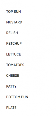
The next step in organizing your menu is to rethink your item labels. You want them descriptive enough to tell the user exactly where they will lead, but not unnecessarily long. You also don’t want any items to repeat. Let’s rethink some of the items on our hamburger menu and rewrite it yet again:
- Top bun
- Mustard
- Relish
- Ketchup
- Lettuce
- Tomatoes
- Cheese
- Patty
- Bottom bun
- Plate
First of all, the repeated “bun” item has been clarified into a top bun and a bottom bun, indicating the difference between those two menu items. Next, the vague “toppings” category has been replaced by the specific toppings of this burger: lettuce, tomatoes, and cheese. Finally, the unnecessary description of the patty has been removed. That information can go in the page itself.
There are both SEO and usability reasons to make these changes. On the SEO side, if a user is searching for “lettuce”, having this term in the header and menu of a page makes it more visible to the search engine, as opposed to the generic term of “toppings”, a term which someone specifically seeking lettuce may not use. For usability purposes, these changes also make the website easier to navigate. Would a user know for sure that they would find information on lettuce under the toppings menu item? Not to mention the confusion one would face when presented with the puzzle of two distinct “bun” items on the menu.
Less is More: Get Rid of the Garnish
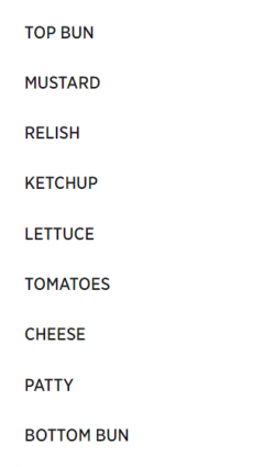
The “plate” menu item has made it thus far in our menu clean-up journey, but here is where we fondly leave it behind. Removing unnecessary menu items helps clean up your menu and make the rest of the menu items stand out more.
- Top bun
- Mustard
- Relish
- Ketchup
- Lettuce
- Tomatoes
- Cheese
- Patty
- Bottom bun
A long-standing rule of thumb, based on the psychological study of short-term memory capabilities, is to limit the number of items people need to remember to seven. More recent research suggests, however, that while seven is fine for needing to recall a series of numbers, short-term memory holds something more like five items, when it comes to words. In this case, less really is more (more memorable, more effective, and more clear!)
Combo Meals: Using Sub-Items Effectively
Speaking of short-term memory, research suggests that people remember items better when grouped meaningfully, in a process called “chunking”. You can take advantage of this little bit of psychology by creating meaningful groups for your menu items, also reducing the number of top-level items in the process.
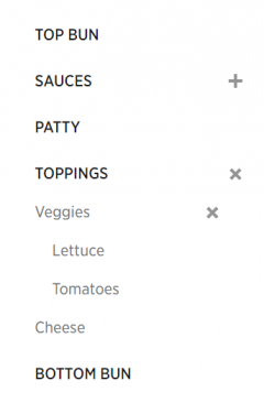
Time to bring back those less descriptive labels as top-level items, which can then be expanded to see more descriptive sub-items:
- Top bun
- Sauces
- Mustard
- Ketchup
- Relish
- Patty
- Toppings:
- Veggies
- Lettuce
- Tomatoes
- Cheese
- Veggies
- Bottom bun
Using sub-items is a fantastic way to simplify your menu and group similar items. This makes the menu much easier to scan and navigate. One effect of this process to keep in mind, though, is that this makes users less likely to click the landing page for items that expand into sub-items. For example, a user looking for the “Lettuce” page will likely expand the “Toppings” and “Veggies” parent items and navigate directly to the “Lettuce” page. So, if you have very important lettuce-specific content hidden in the ”Toppings” and “Veggies” pages, be sure to also include that content on the “Lettuce” page itself.
Bon Appetit!
To summarize, here are the steps of reorganizing your menu, without the extraneous hamburger allusions:
- Put important items at the very top or very bottom of your menu
- Group like items and organize your menu in a logical way
- Make labels descriptive and clear (but not unnecessarily long)
- Remove unnecessary items
- Use sub-items to further group items and split up your menu
Unless this post has made you too hungry to focus, you’ve hopefully now acquired the tools to build a better menu. On the technical side, see our Site Navigation tutorial for help cooking up your menu. Now, it’s up to you to review your site’s navigation and see where you can implement this information. Good luck and thanks for dining with Web Services!
Articles referenced
I referenced these (oddly burger-less) articles in creating this post – feel free to check them out for further tips: