Coming out on top: the new top nav menu in cuTheme
One exciting development we can’t wait to bring to you with cuTheme is the top navigation menu.
Top refers to the position of the navigation in the new template – it runs horizontally across the top of all your pages. It is a real leap for us as well as for you, but once you start looking at what most other major websites do in terms of positioning their site menus, you will quickly find that most big-hitters have already adopted this approach.
Whether you read your news on the CBC, The New York Times, or CNN, buy your clothes at Old Navy or Nordstrom’s, or dine at Del Monico’s or MacDonald’s, you are going to find that top nav menus have become the norm. We are adopting the top nav menu for many reasons including consistency of look and feel, availability of more real estate for your content on the page, and improvement of accessibility.
The best thing on the menu
Let’s take a look at the benefits in detail:
Accessibility
This menu is in the same place on every site AND when you scroll down the page
Usability
As we say, an accessible website is a usable website: those same reasons that help people with disabilities help anyone browsing a Carleton site
Consistency
Now people will enjoy the same position for the menu on all cuTheme sites, plus other major sites such as Students, Admissions, and Graduate Studies
Real estate
Removing the left hand nav means we can use much more of the page – and look out some additional widening options in cuTheme
Resourcing
Web developers in our team no longer have to check every template change works with top and left nav as they do with Framework at the moment. this means more time to develop the new features you request.
How to get to the top in website layout
Start by looking at the pages on your website.
- Are they organized hierarchically? The most important pages should be at the top level with subpages beneath.
- If your site is an academic department focused on recruitment, do you have items for prospective students and current students? Can prospective applicants get to the info they need quickly?
- Are important pages buried? Do they need to be moved up the hierarchy/made top-level?
- View your pages from the back end: We have a tool for this you can learn about and initiate here.
- Talk to the people who deal with inquiries around information via other media in your department, for example, front of office colleagues. Are they constantly fielding calls or emails because people can’t find certain info on your site? Should that info be highlighted in the menu?
- Look at other departments and even other universities to see what they are doing well. Co-opt their ideas.
We have a whole checklist of things to do in order to create the perfect navigation menu in an earlier post.
Who’s in the business of effective top nav menus? Sprott!
Now let’s dive in and see a great example of how to consolidate the menu into just a few items. The Sprott School of Business are the epitome of menu consolidation. Sprott, of course, hosts a lot of content on their site, so they needed to be economic and efficient in how they organize their menu.
Of course, they knocked it out of the park. They have four navigation items on their top nav. We featured the reorganization of their site in a news story An Exemplar cuTheme Site: The Sprott Success. In that post, Liz Lariviere from Sprott explains that they as a team, “started by benchmarking about 25 different Business school websites [in Canada and the US] … We looked at their nav, web architecture, and content. We noticed that the better sites had 3-4 menu items and their content was succinct and very visual.”
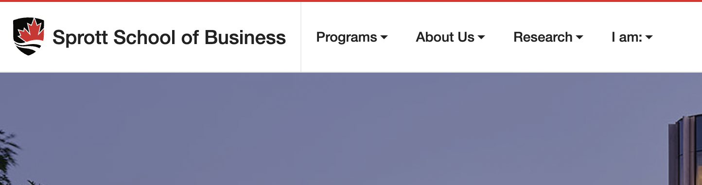
Notice that the Sprott team inserted an innovative item on the menu labelled I am. This avatar-led approach (creating the idea of a role or path that a person visiting the site is on) is another great way to channel a user to the content they need or want. Avatar roles could include “I am a future student“, “I am a student seeking an accommodation” or even, “I am a visitor to campus seeking a sandwich.”
We are so excited to see how you take on the challenge and opportunities offered by creating a top navigation menu on your site when it comes to migrating your site(s) to the new cuTheme template!