In order to “see” the original in-situ positioning of our artifacts, we must plot each one according to 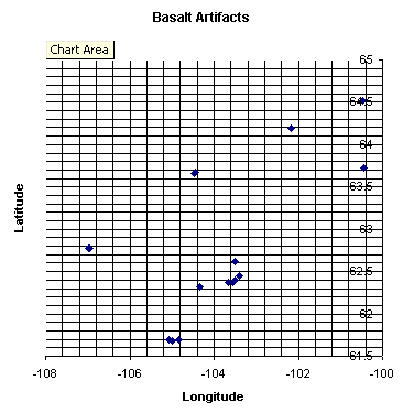 its survey coordinates. These X-Y values are measured with respect to the main datum established at the start of the survey. As our records contain these values, we want to choose the most expedient method of generating a plot – perhaps many plots – during a study session.
When we are performing a basic trend analysis over a large geographic area, we may export our search results to a spreadsheet graph, as shown here. Whether our sample is small or large, there are limits to what can be displayed in this viewer. The chart represents 298 records of tools knapped of basalt, found primarily at three stratified sites within our study range. As it is only a summary view, we will need to look closer for details.
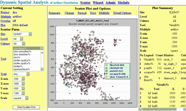
Our software engineer, Raymond Cheng, has developed a visualization tool for our work with these databases. It allows us to present a colour plot and datasheet of our artifact types in any combination, functional groupings for all activities (e.g. tool manufacture), and any single or cultural grouping, at any excavation level or surface. We can design, record and reshape queries to produce a text and visual solution to our inquiry. His program is appropriately named “Dynamic Spatial Analysis of Artifact Distribution”, or DSA.
Below is a sample plot of the Hide Preparation activity that took place on the major site KjNb-7, encompassing eight distinct cultures. By selecting a specific era from our pull-down menu, our search is narrowed to that culture. The plot legend lists our range of search items that would be used in this critical work process. Knives were used to skin the caribou; scrapers were used to remove flesh, fat and fascia; chithos were used to soften hides; and skin flexers were used to shape hides for special purposes like pouches, leggings and moccasins. Did you notice that we added projectile points that really were not a part of hide preparation? Just testing!
For more detailed examination of a typical plot, we may alter our scale to “zoom in” to an area of interest, and change the style and colour of the symbols that are automatically generated for our convenience. The axes values are calibrated to ground measurement in centimetres, within a site gridwork of 2 by 2 metres. Main datum for this site is located at 0,0.
We must often look for a series of attributes for a single or a class of artifact. If the DSA does not contain a scattergraph parameter for selecting material or color, for example, we must first create a a custom data subset for our plotter. This is accomplished by creating a Boolean search statement with these attribute qualifiers, like our example in red below. We key in this statement, and the database manager generates our results.
(ART_DESC LIKE (‘%knife%’) AND (MATERIAL LIKE (‘quartzite’) AND (LENGTH < 0) AND (COLOUR LIKE (‘beige’)))
OR (ART_DESC LIKE (‘core%’) AND (MATERIAL LIKE (‘quartzite’) AND (LENGTH < 0) AND (COLOUR LIKE (‘beige’))))
We can then make this search result selectable on the DSA menu, and plot the subset. For researchers working at this macro level, their ability to construct these statements is quickly developed.
Below is a plot of male stone knappers who chose beige quartzite cobbles from the riverbank to make knives using hammerstones. Eighteen are represented but more are likely needed. We then plot other colours of quartzite. Hundreds of artifacts were on this floor.
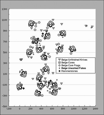 A recent change to our plotting routine now permits us to combine multiple classes of search results to produce a single scatterplot. Previously, these overlays would have to be merged, using an image editor program. One important feature we continue to insert into press-ready plots is a task symbol to represent the focus activity and its scaled orientation on the ground. Shoulder widths of men (45 cm) and women (35 cm) are to scale; icon orientation is calculated by the pattern of scattered artifacts, the space needed for the activity, handedness (10-20% left-handed), and in some cases wind-direction and its effect on smoke from a fire or an individual.
Our Basalt chart (top of webpage) can be augmented by a backdrop map in the DSA display, as we move beyond site analysis to the full study range. We can highlight any artifact with our mouse to show its labelled identity.
| DSA Technical Information
Platform: Standalone Wintel PCs running individual copies of database in local server-mode Environment: XAMPP Distribution set (Apache HTTPD, MySql, PHP, phpMyAdmin); |
 |