CuTheme Update: 7 Key Changes for Content Editors (New Menu Bar)
In our latest efforts to get you pumped about our new cuTheme, we’re rolling out a seven-part blog series where we’ll be showcasing new features available with our updated theme.
This is our second post in the series and we’re covering the new menu bar!
Post 2/7: New Menu Bar
The new cuTheme comes with a new menu bar that is more intuitive and easier to use.
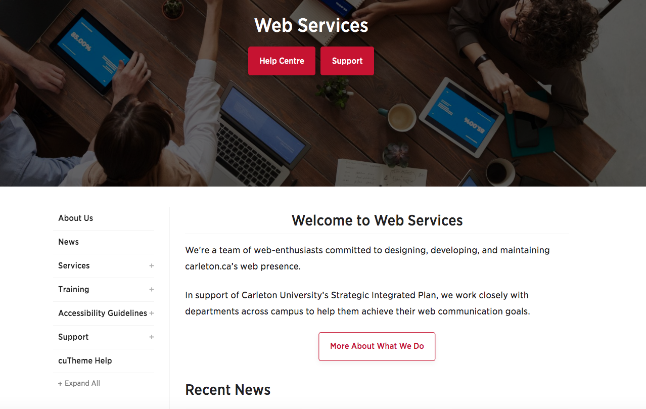
What’s even better is you will now be able to choose whether your menu will be displayed at the top of your page, or along the left-hand side as shown below.
Drop-down items on top-level menus will now stick, without having to hover the mouse over them, making it easier to navigate to secondary pages.
Best Practices
Along with the new menu bar, we wanted to share some best practices when it comes to creating and adding to your menu bar.
Here are a few best practices to follow:
- Avoid adding all your pages to the menu. The most important and/or most used pages should make up the first level of the menu
- Avoid having too many dropdown menu items, as this can make the menu bar messy and harder to navigate for your users
- Try to use intuitive, short names for the items in your menu bar to make it easier for users to find what they are looking for
- Have the menu items in a logical order such as the Contact Us page at the end of the menu bar
All of this information, along with training videos, can be found on our new cuTheme help center. The help center covers all the features of cuTheme, best practices, and accessibility ruless
Be sure to check it out!
If you want to learn more about the new cuTheme and see what it looks like, check out the coffee break recap!