A poster can be a great tool at a conference for drawing people into conversation and give the audience a visual representation of your work. It is important to have a well put together poster that is easy to read and can be eye catching. The following are suggestion, please consult with your supervisor to make sure you meet their requirements.
Here are a few do’s and don’ts for creating a scientific poster.
Do
Use the right program
PowerPoint is often used a a program to make the posters, however it is important to make sure to change the page sizes before beginning your poster.
What size should my poster be?
We recommend you prepare your poster to be a maximum of 4’ X 4’. However you may need to consult with your supervisor about proper poster sizing.
Note that if you choose to print your poster via a wide-carriage (poster) printing service (e.g. the GLEL, Staples, Codes Pro Media, etc.) you will not be able to format your poster this large. It is best for you to consult with your printer to determine exactly what size of poster you can print on their equipment.
Keep it simple
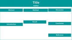
You want to show off the highlights of your research; pick a few key figures and make sure they’re clearly explained.
Keep it big
People shouldn’t need a magnifying glass to read your poster, so make sure to stick with a nice large font size: minimum size 14!
Use Legible Font
For your body text, use a serif font, such as Cambria, as these are easier to read when they are small. For your main headings and sub-headings, a non-serif font such as Calibri is fine.
Use Color (Sparingly)
You want to make your poster as inviting as possible – no-one wants to spend their tea break looking over a boring, drab black and white poster!
Ensure proper printing
It is important to give 48 hour notice to a print shop to ensure that your poster will be properly printed, and this will also allow you time to fix any problems or misprints that might come about. You can have your poster printed at Staples or the Carleton Print shop.
Sometimes everything looks absolutely fine on your computer screen, but when it’s printed, colors might look brighter and things might move about a bit! It’s better to find these things out before you go to The Print Shop. Thus printing your poster on a small page as a test will give you a better idea of the end result.
Don’t
Try to cram too much in
A cluttered poster is a nightmare to look at, you don’t want people to skip over viewing your poster because it looks like it will give them a headache! Make sure you’re poster is clear, concise and easy to follow.
Pick extremely bright colors
While you want to have some color in there to keep your poster looking pretty, don’t go over the top with it! A hot pink poster might seem like a great idea way to stand out, and it might even look fantastic on your computer screen but when it’s printed out it can be a whole other story! Very bright colors or mixtures of bold colors can be painful to look at, stick with light neutral tones and have plenty of white space.