Coffee Break Recap – October 2019
If you missed this week’s coffee break, no need to worry! Here’s a quick recap for you.
Mary Kathryn started off by introducing our team. We have grown over the years to a team of 8. If you don’t know us all, find out the juicy details here.
What We’ve Been Up To
We talked about some of projects and services we have been working on and support on an ongoing basis. These include:
- Carleton home page
The home page was recently redesigned. It is super-fast and has been sending a ton of traffic to other key Carleton websites (Research, Newsroom, Undergraduate Admissions and Graduate Admissions). - Intranet
In collaboration with DUC, HR and ITS, Web Services launched the intranet in December 2016. Since then it has grown a lot and in September, over 2,500 people logged in! - Websites, websites, websites…
- Internal sites – We now have 88 internal, password protected sites that are used for all kinds of things across campus including process documentation, committees and to house knowledge base/wiki type information.
- CMS – The Carleton Content Management System is used by over 600 sites, from academic departments to research projects and labs.
- Framework – 55 sites use Framework which was launched in 2015 to meet the needs of high-level sites at Carleton (e.g., faculty sites like Engineering and Design)
- Other stuff
Besides all of this we also support 5 custom websites, a booming e-commerce solution, cuLearn, cuPortfolio and are now piloting custom forms.
Exciting New Things (Hello cuTheme..)
CuTheme is the new web template that our team has been hard at work designing and developing. It will encompass both Framework and CMS into one super powerful template. Development has been guided by several things including the new homepage, changes to WordPress, our advisory group, and the feature requests and feedback we’ve received from our clients.
Some of the key changes will be seen on the dashboard (tools to make your job easier as an editor), drag and drop content creation and re-usable content blocks.
A Strong Foundation
The intention is to create a modern, simple and intuitive web template. Troy shared a bit about the overall process we have been going through. To start with we wanted to streamline and simplify, increase security, speed and accessibility. We evaluated what we are currently doing in to see what could be improved. As a result, we now have brand new shiny servers and have reviewed all of all of our plugins and code to make it better.
Troy also gave us a sneak peak into the backend (based on Gutenberg, the new WordPress initiative) that you will use to add content to your site.
Front End Fun
Although there will not be a dramatic change to the overall look and feel of your site, there will be some key changes to the front end that will give you more options a lot more flexibility. These include:
- Navigation options – can be at the top or side
- Blocks that allow you to incorporate and layout content in different ways
- Flexible content organization so that you can arrange your pages to suit your needs
- Lots of new images for banners and thumbnails
- Extras: an API to share content across sites, brand new newsletter
Supporting our Clients
If this all seems overwhelming, don’t worry, we’ve got you covered! We have lots ways to support you through the entire process.
We are creating new documentation (videos, how tos and best practice guidelines) We will be providing group training as well as one on one trainings like we do now. We will also continue to hold workshops on specific topics such as writing for the web, web accessibility and whatever else you are interested in – let us know!

Rollout Plan
We will be piloting cuTheme from November to January. The intention is to thoroughly test and troubleshot the new theme and to get feedback from our users.
In January we will begin official rollout. Here’s what the process will look like:
- We will move a copy of your site to our staging server while your current site stays live.
- We will migrate your content, provide you with training and do an accessibly audit.
- Before your new site goes live you will have a chance to review it and will know how to add and edit content yourself.
- Celebrate you new site!
That’s it for now! If you have any question or concerns, please feel free to get in touch.
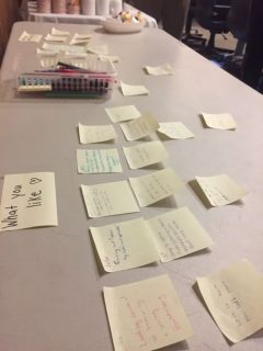
Thank you to everyone who shared their thoughts on our current theme via sticky note. We always appreciate hearing from you!
No file posts are available.