Icon Cards
Module 3.2 – Mastery: Featured Content Blocks: Icon Cards
Table of Contents
The Icon Cards block is a block that is used to highlight content, similar to Featured Cards. You can use it on your homepage (like Quick Links in our CMS theme). Or you can use it anywhere else on your site to draw attention to info and other pages on your site. The icon cards block features text excerpts, icons, and buttons for calls to action.
Step-By-Step
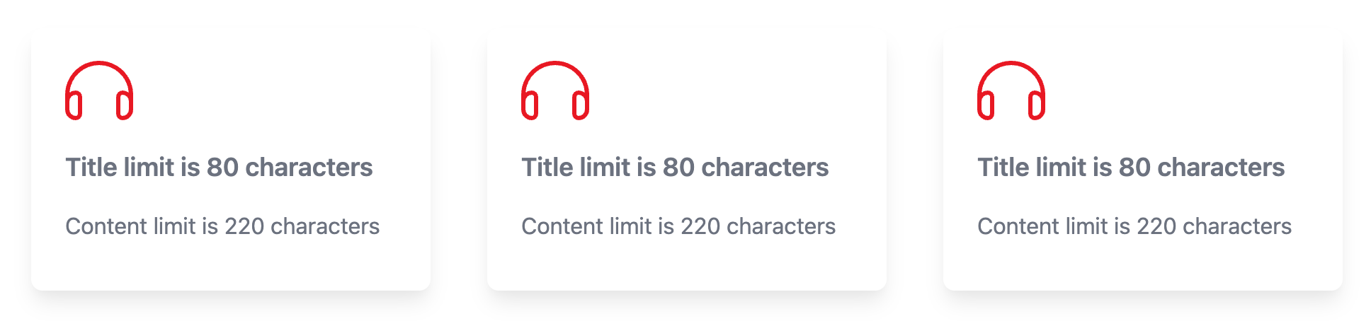
1. To add an “Icon” block, open up the block menu and select “Icon Cards.”
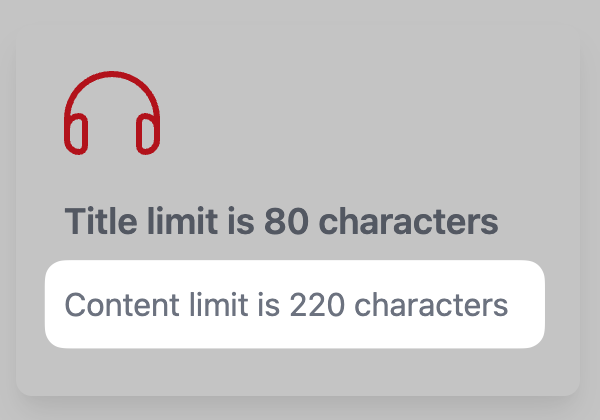
An empty row of 3 icon cards will be added to your page with a default “headphones” icon.
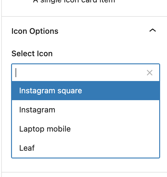
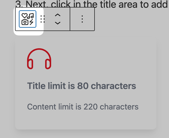
2. Start by clicking on a single icon card within the block. Under the block options tab, select your icon from the dropdown.
3. Next, click in the title area to add a title. (Note the 80-character text limit)
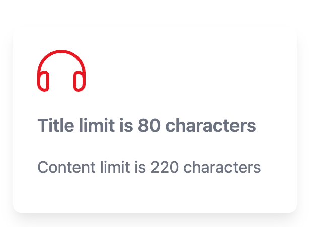
4. Click in the content area below the title to add a description.
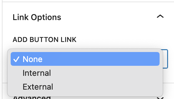
5. Under block options at the rught, add a button by selecting Internal or External and then add the URL.
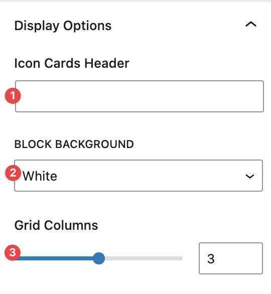
6. Access options for the entire block by clicking at the top left of the context menu.
Choose your options under the Block tab.
- Add a header for the block.
- Select white or grey for the block background.
- Select the number of columns (icon cards in each block).
Video Tutorial
-
In this video, we are going to explore using Icon Cards for your website’s content.
Icon Cards are very similar in functionality and appearance to Featured Cards. The difference being instead of a featured image, you use icons instead.
An example set of icon cards is shown in the screen in different customization options you can go for.
Now that we have explained the purpose of a Icon Cards block and how it can improve your website’s content, we will now show you how to add them to your pages.
First, you want to go into editing mode of the page you want to add a block into. Then navigate to the block menu and add the block to your page.
Once its on your page, you can enter the information you want into each card.
If you want to insert more information in each card, lets say a button, or change the icon in a card, you can do so by clicking on the card you want to edit – a menu on the right should appear.
From there you can change your card’s icon or add a button link.
If you want to add another card, select anywhere in the block and click “select icon cards.” A blue plus button should appear on the bottom right of the block. Click on that and a new card should appear
If you want to customize the block as a whole, select the whole block using the same method you just did to add another card.
A menu on the right should appear, and from there you can:
- Add a header
- Add a description
- Choose background colours
- Change your column amount
As well as change card specific appearances such as background colours, card shadows, icon background, or icon shadows.
And by finishing those steps, we have now successfully added Icon Cards to a page.
Try it Out!
- Add an Icon Cards block
- Change the icon from the default
- Add a title and some text to each icon card
- Add buttons to the cards
- Play around with the various block options to change the number of columns and display options.
- Preview your page!