Alerts Block
Module 2.2 – Mastery: Design Blocks: Alerts Block
Table of Contents
The alerts block is useful for highlighting an important message to your website visitors.
Step-by-Step
1. Add the Alerts block using the block menu.

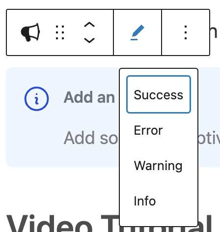
2. Click the pencil icon in the block context menu to choose the type of block: Success, Error, Warning, Info. Each type of block is a different colour and has a different icon based on its purpose. (See examples of each below)

Alert Box Examples
Success
Example of a success alerts block
Error
Example of an error alerts block
Warning
Example of a warning alerts block
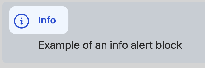
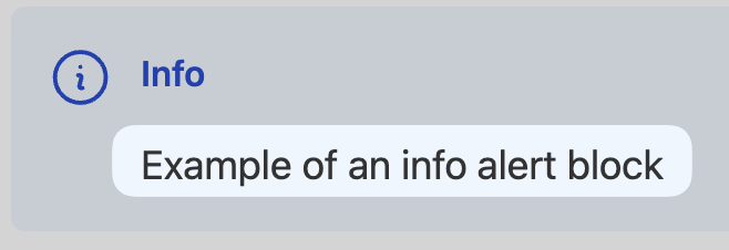
Info
Example of an info alerts block
3. Click in the title area to add a title.

4. Click in the description area to add a sentence or two. Note you can also add a hyperlink in this area to take the user to more info.

Video Tutorial
-
Welcome to CUTheme Mastery Training, Module 2. In this video, we will cover alerts.
Alerts are used for important messages on your site that you want users to see. They stand out from the background, and draw the user’s attention.
To add an alert, upon up the block selection menu, and under “Design”, select “Alerts”.
There are 4 different types of alerts. You have a success, an error, a warning, and an info alert. You can choose which type fits best for your application. You can then add a header to your alert, and some body text to add more information. For the body text, you can bold, italicize, and add a link if you want.
Try it Out
Now that you have learned how to work with the alert block, it’s time to try it out!
- Add an info alerts block to your page.
- Add a title and a description.
- Convert the block to an error alert.