Buttons
Module 2.1 – Mastery: Design Blocks: Buttons
Table of Contents
The “Buttons” block allows editors to add a link to their content using a button. This catches the attention of the website visitor, calling them to engage with the content. This is referred to as a call to action (CTA).
You have seen examples of Button blocks all over our training site. These include the dark gray “Examples” buttons and the red “Next” buttons are seen throughout our training modules.
Step-by-Step
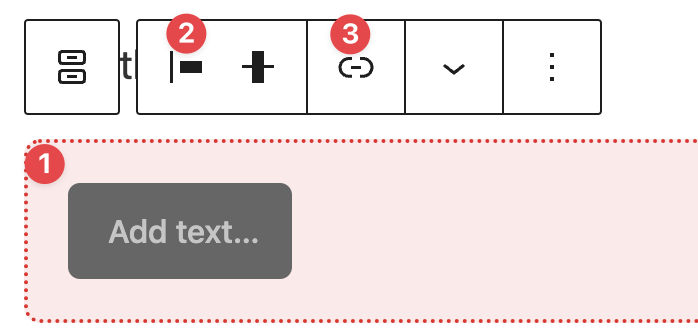
1. Add the Buttons block using the block menu.
2. Configure your buttons by clicking inside the button area to:
- Add text
- Align the button
- Add a hyperlink
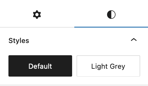
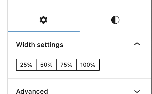
3. In the block options at the right, configure:
Styles: button colour – red (default) or light grey
Button width: 25% – 100%
Video Tutorial
-
Hello and welcome to cuTheme Mastery training Module 2. In this video, we will cover buttons.
Buttons allow users to link to other content on their website. By clicking on a button, viewers are redirected to wherever that button links to. There are different ways that you can customize buttons on cuTheme which we will go over now.
To add a button, click on the Block Selection menu, and under design, click on buttons.
When the button is added, you’ll get a formatting menu above. You can click on the button and type what you want the button to say.
You can change the button’s alignment – either left, center or right. You will need to add a link to the button to pass the accessibility check and to make it functional. to do that, highlight the text then click on the chain icon. You can either select a page from your website or paste the URL into this text block. Then click Apply.
To add more buttons to your block, click on the block’s background and click the blue plus sign on the right. Now you’ll have all the same options for this button as the original one.
Over on the right hand side, you’ll see you have some options for the button itself. In order to style it, click the Styles icon. The default is red. You can also select light gray to make your button light gray.
Lastly you can choose how much of a line your button takes up – either 25%, 50%, 75% or 100%.
Try it Out
Now that you have learned how to work with the buttons block, it’s time to try it out!
- Add a button block to your page
- Add text and a hyperlink
- Change the alignment, colour, and button size