Image Grid
Module 2.6 – Mastery: Design Blocks: Image Grid
Table of Contents
The image grid block is great for highlighting 3 to 5 images in a visually appealing way.
Step-by-Step
1. Add the Image Grid block using the block menu.
2. Add images by selecting an single item within the block grid and then click Select Image. Noet the minimum recommended image size is 768 pixels wide.
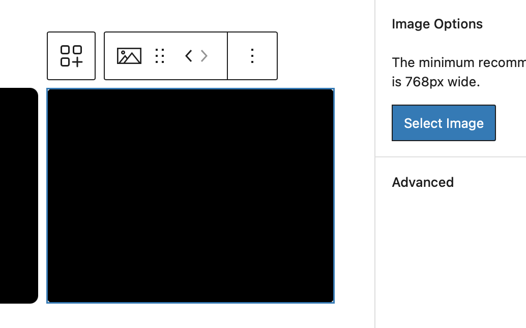
3. Once you have added an image, you can customize using the block options to the right
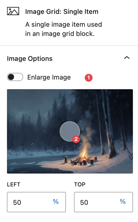
- Toggle the button to enlarge the image
- Drag the image to position it relatively within the block
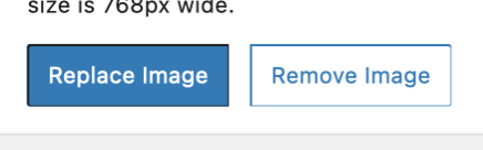
4. Replace or remove the image by selecting a single item and then clicking Remove Image or Replace Image.
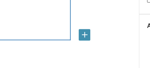
5. To add another single item (image), click the blue plus sign at the right of the block.
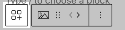
6. Once you have added several images, you can change the order using the arrows in the contextual menu above the block (click a single item to view the menu).
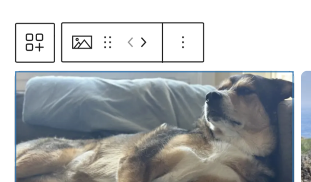
7. Select the entire image grid block by click the icon at the top left. You can now customize options for the entire block using the display options under the block tab at the right.
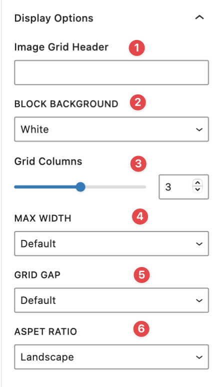
- Add a header for the block
- Select a background colour (White or grey)
- Customize the number of columns (2, 3, or 4)
- Customize block width (Default, Large, Max)
- Increase grid gap by selecting large
- Change the aspect ratio. Options are Landscape, Portrait and Square
Video Tutorial
-
Welcome to this tutorial on mastering the Image Grid Block! In this video, we’ll guide you through creating a visually appealing image grid, which is perfect for showcasing three to five images.
Let’s get started with a step-by-step guide:
Add the Image Grid using the Block Menu.
Next, you can add images by selecting a single item and then clicking on “Select Image” over here on the right.
Note: The minimum recommended image size is 768 pixels wide.Once you’ve added an image, you can customize it:
- Click on the single item and use the block options on the right.
- You can change the relative position by moving the adjustment wheel.
- Enlarge the image or replace it by clicking the “Replace” button and choosing a different image.
- If needed, you can remove the image altogether.
To add another image, click on another single item, select an image, and choose one from the media library.
After adding several images, you can:
- Change their order using the arrow in the contextual menu to shift images from side to side.
- Select the entire block by clicking on the image at the top left of the contextual menu.
Now, let’s explore the display options for the entire block:
- Add a header: You can give the block a title or description.
- Change the background color: Choose gray, white, or another option.
- Control the number of columns: For example, here we have four columns. To add a fourth image, click on the blue plus sign at the bottom, then select an image from the media library.
- Adjust the width: Options include default, large, or max width.
- Customize spacing: Change the size, padding, or gap between images.
- Choose the aspect ratio: Options include portrait, square, or the default landscape.
There are many other configurations available. Explore the Block Library to discover additional ways to customize your Image Grid.
Try it Out
Now that you have learned how to work with the image grid block, it’s time to try it out!
- Add an image grid to your page.
- Select a few images.
- Publish and preview your page.
- Try out some of the image grid options.
- change the number of columns
- change the order of the images