Subtraction
We have now seen yet another version of the proposed subtraction from the Château Laurier. I know I’m supposed to call it the “addition to” the Château, but I just can’t live with that lie any more. This is not an addition to the beloved and historic hotel. It’s a subtraction from it.
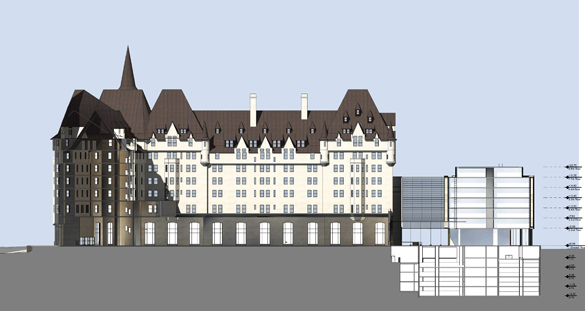
Why? Frustratingly, for exactly the same reasons that the first version of December of 2016, and the re-thought version of February this year, were failures. Not one of these designs has even attempted to harmonize in a meaningful way with the historic hotel. Old and new remain visually and viscerally at war. The Château is all about romance, passion and dreaming out loud. The extension has all the romance – and the appearance – of a spreadsheet. The Château breathes fire. The extension throws water on it. New features like the limestone ‘fins’ are a cheap, superficial, simple-minded sop, intended to create the illusion that the designers care about what their critics are saying.
Perhaps the most exasperating aspect of this is that we seem to be going in circles. The problem with the first version was that it was profoundly insensitive to the historic building. The problem with the second version was that it was profoundly insensitive to the historic building. The problem with the latest version is… well, I think you get the picture. Architect Peter Clewes has been impressively resourceful and creative in thinking up different ways to make the same mistake, but none of it has gotten us any closer to an acceptable design. Think I’m exaggerating? A lot of people complained that the first version, way back in December of 2016, looked like a barcode. Do you think they’ll consider this an improvement?
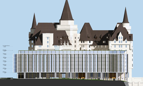
Although the design hasn’t improved over the last eighteen months, the skill with which the architectural renderings conceal its shortcomings definitely has. This view shows the design from an iconic vantage point that I and others have singled out as being ruined by the proposed design:
It almost looks downright unobtrusive, doesn’t it? That’s because the extension – and in fact the whole Château from this angle – is in shadow. It all dissolves into a somewhat indeterminate murkiness. What’s more, the trees below have experienced a growth spirt, and cover much of the new building. The message seems to be that the extension doesn’t look too bad at all – as long as you can’t really see it.
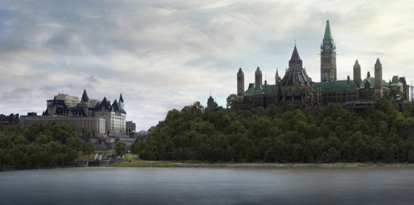
Here, alas, is what the site actually looks like on a crisp winter day:
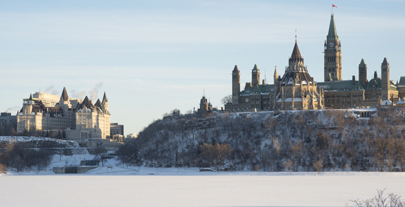
One would have hoped that the architect had enough confidence in his design to show it in sunlight. Unfortunately, the cold light of day will leave the building nowhere to hide.
To be fair, not quite all of the renderings are so manipulative. Here’s one that shows what we’ll really get to experience from Major’s Hill Park:
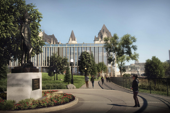
Undeniably, that is a handsome building. Unfortunately, there’s a glass box blocking the view of it.
Although we are further than ever from a suitable design, the political process is, astonishingly, nearly complete. City Staff will issue its recommendations on this proposal by June 11. The Built Heritage Sub-Committee will meet on June 18 to determine its recommendations to the Planning Committee. Planning Committee will meet on June 26 to decide what it will recommend to the Mayor and City Council, and the Mayor and Council will meet the next day to vote on whether or not to allow this to go ahead.
For the City of Ottawa, this is a massive test. It’s not too late to prevent this debacle, but to do so will require effort and determination. Is there any genuine vision for heritage at City Hall? We’re about to find out. The implications for the heritage movement in Ottawa are huge: if we can’t save the Château Laurier from this fate, how can we ever expect to save anything?
Peter Coffman
peter.coffman@carleton.ca