Estimated time to complete: 10 minutes
Module
What should my alt text be for a linked image?
Alt text on linked images plays the dual role of both describing the image (where appropriate) as well as signaling where clicking the image leads.
 Let’s bring in a familiar image, this time linked to the Carleton University Art Gallery’s First Nations and Métis collection.
While the alt text should still cover information that the photo is trying to convey, it also needs to signal the result of clicking the photo. The primary reason why alt text for linked images must include the link destination is so that screen readers can provide users with the necessary information to navigate the web page.
For example, depending on the context in which the photo is included, you could write the following alt text: “Mary Anne Barkhouse’s Locavore, when clicked brings you to CUAG’s First Nations and Métis art collection page.”
What about images with text in them?
As with most alt text, this depends on context. Let’s return to our rule of thumb: alt text should convey the meaning and purpose of an image. Therefore, if the text in the image is part of the meaning and/or purpose, it needs to be replicated in the alt text.
Let’s consider some examples of text in images:
1) The text doesn’t matter in the meaning of the image
 Here, the titles of the books are likely not important to the overall meaning of the image. In this case, the alt text could be something like “A line up of paperback books”.
Of course, if the purpose of the image was to point out a specific title in the line up, this title could be mentioned in the alt text. As well, if the image is purely decorative, no alt text is needed.
2) The text is essential to the meaning of the image

The purpose of this image is to convey the warning written within it. This information should not be conveyed in an image. Text is much more accessible (and also SEO-friendly) than images, so any images of just text should be replaced with text itself.
If, for some reason, this image cannot be replaced with text, the alt text should read exactly what is written here, since that is the meaning of the image: “Warning: Content within is suitable only for those 18 years of age and older”.
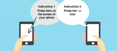
This second image also contains text that is vital to the meaning of the image. The instructions in this image should be conveyed in the body text of the content instead. Having the instructions just in the image is inaccessible; and fails to convey the information to anyone who cannot see the image. The solution, in this case, would be to describe the instructions in the body text, including any information conveyed by the visual elements of the image.
3) Complex images
Some images, such as graphs, are difficult to concisely describe in alt text. There are a few approaches you can take to making complex images accessible. The main rule of thumb, though, remains the same: explain the meaning of the image in the context in which you are using it.
This is an example of a complex image with appropriate alt and surrounding text