Learning Outcomes
By the end of this module, you will:
- Consider how users are navigating your website and how you can help them more easily do so
- Identify where you are leading visitors on your pages with CTAs, links, and buttons
Estimated time to complete: 20 minutes
Module
Navigation can be understood as both the pages in your site’s menu, as well as additional CTA’s, links, and buttons within the pages themselves.
What’s on The Menu?
The side menu is your visitor’s primary tool for navigating your website, which means you want it to be clear, concise, and descriptive. Some questions to ask yourself while looking at your menu are:
- How many items are there in your menu? Try to keep your top-level navigation (the menu items that are immediately visible) to around 7 items or less.
- Is it logically organized? If you were a visitor looking for a sub-item, would you know to click on the item it is organized under?
- Do any menu items repeat? If you’re not sure where to place a menu item, that might be a sign that your organization system is unclear.
- Are the item labels clear? You want it to be clear where these menu items lead, without making them unnecessarily long. For example, you would probably want to put the label “Documents (2022)”, rather than “Docs” or “Documents from January 2022 – December 2022”, unless you had a specific reason for adding or taking away information from the label.
- Is there anything in the menu that does not need to be there? Not everything has to be included in the menu!
Try to look at your site from a visitor’s perspective. It may be helpful to have someone who is less familiar with your site have a look and give their thoughts. Can they easily find the pages they are looking for? Do they check the wrong items when looking for sub-items?
For more helpful tips and explanations of how to best organize your menu, read our blog post on building effective website navigation.
Pulling Analytics for your Navigation
Go deeper by looking at the page views in your navigation to see how many come from the homepage. It’s not an exact science, but this will give you an idea of how well your navigation is working for these particular pages.
- Go to Behaviour > Overview
- Click view full report at the bottom of the list of pages
- Click on the page of interest (or search for it)
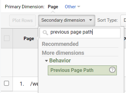
- Go to Secondary Dimension > Behaviour > Previous Page Path
- Note how many page views come from the homepage
This data might also be influenced by whether or not your homepage prominently links to this page.
Taking the Path Most Traveled By
Open your top 5 pages and check what links, buttons, and other CTAs lead out of the page. For example, these tutorial pages end with a button leading to the next step of the training. Are you also leading your visitors where they should ideally go, or are you sending them off to destinations unknown? Your anchor text for any buttons and links should also clearly indicate where it leads, so that visitors aren’t misled.
It might be helpful here to establish page goals. These will be related to the website goals identified in module 2, but pertain to specific pages. For example, you might want visitors to:
- Complete and submit a Contact Us form on your Contact page
- Read the tutorial and then click to the next one on an instructional page
- Download a PDF with program information on a page of program offerings
While visitors to your site will of course take whatever path they believe will lead them where they want to go, you can structure your site in a way so as to guide them down the paths you believe will be the most helpful to both their goals and those of your site.
Video Tutorial
Transcript
Take Action
Especially if your site has been around a while, cleaning up your navigation is very useful. If you’re unsure where to start, you can easily map your menu out by using bullet points to delineate the levels of your items. For example:
- Documents (2022)
- January
- Contact
Use this technique to map out a more organized menu for your website, removing unnecessary pages from your menu, and cleaning up item labels.
As well, open a few of your most important pages and think about where they naturally lead you as a user. For example, if one of your pages is about signing up for an event, the main link, button, or CTA on the page should link you to a page where you can sign up for the event. Make sure that the link, button, or CTA text clearly shows where it will take a visitor when clicked.