By: Christine Streeter, Contract Instructor, PhD Candidate, School of Social Work, Faculty of Graduate and Postdoctoral Affairs
One year has passed since the declaration of a global pandemic and how we live, and work, has changed. With the disruption in our lives, we have had to learn many new technologies on how to engage and communicate with each other, and I completely understand the last thing anyone wants to be doing right now is to grasp yet another Learning Management System (LMS).
During the Winter 2021 term, I participated in the Brightspace pilot. I am grateful to have gained some experience and practice with the new system before its official launch on May 6, 2021. Teaching and Learning Services (TLS) has provided bi-weekly meetings where the group of pilot instructors could meet, learn, discuss and share ideas about Brightspace. And I am here writing this post to provide some relief – learning how to use Brightspace is not as bad as you may think (and that’s coming from a very tired PhD student).
My goal for this post is not to sum up everything we learned, as there are many helpful webpages and workshops on these details already. Rather, I hope to share with you with five takeaways that helped me as I transitioned from cuLearn to Brightspace. The support from TLS in conjunction with these takeaways resulted in a successful transition for my small class of 20 students. I have received no negative feedback about the Brightspace transition, which I view as win for me and for my students. As I walk away from this term, I would like to share these takeaways and hopefully provide you with optimism as you make the cuLearn to Brightspace transition. Here is what I learned:
Takeaway #1: Start by keeping it simple
You might be feeling like there is a lot of information thrown your way about Brightspace and you are correct. You don’t need to know it all right away, but you need to start somewhere. For me, it was easiest to follow the KISS principle – Keep It Simple and Straightforward. My homepage included the basics: a widget for each week, a calendar section to keep track of seminar and assignment dates, as well as an “about your instructor” widget for students to easily contact me.
Takeaway #2: When in doubt, draw it out
While keeping with the KISS principle, I went old school and took out my trusty pen and paper. I drew out what I wanted each week to look like, as a webpage, which included my must-have’s (an overview of readings, accessible link to each video lecture, seminar information and a discussion board). Once I had this image in mind, I was able to clearly lay out a template that I used from week to week.
Pro tip: It is best to have your course outline finished before jumping into the organization of your course page. If you begin too early, you will likely end up re-doing a lot of your work.
Takeaway #3: Get creative
One thing I appreciate about Brightspace is its ability to look more visually appealing. I was able to get creative by utilizing and tailoring photos for the course. I used unsplash, a website with freely useable images, to represent, engage and draw students to the material for that week.
Takeaway #4: Experiment
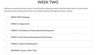
Once I started to feel a bit more comfortable with Brightspace, I was able to experiment and play around with more features. I experimented with HTML templates and the accordion feature – I am a big fan and highly encourage you to check it out. However, there are a lot of other cool features to experiment with too!
Here is an example of what a typical week would look like using the accordion feature (each of these headings has a drop-down menu to the content). It allows all the information for each week to be displayed in one place.
If planned correctly, Brightspace can be a very intuitive system. One pro and con of Brightspace is that you can add a link to access content in multiple places. My experience has been that this is beneficial to some, as students will likely find it easier, but also challenging for others as they experience needing to ‘click’ around more to find something. Accordions provide the opportunity to put everything in one place.
Takeaway #5: Have no fear
Wherever you are on your journey to learning Brightspace, leave the fear behind because TLS has you covered. They have resources available, such as webpages and workshops, as well as consultation opportunities and support. So, despite the distance, let’s learn from and share with each other to master this new system together.
Learning a new LMS doesn’t have to be a painful experience. My hope is that you can take comfort in the ease of my experience, while also learning a few tips from my takeaways. I can’t wait to hear from others about their own takeaways.
Interested in contributing to our blog? Please email tls@carleton.ca to find out how.
